Brian Brown — Art Director with 25+ years at TF Publishing (2000–2026, Art Director since 2001), where I designed 2,500+ calendars and planners and 200+ stationery items for brands including Marvel, Harry Potter, NASCAR, and Hallmark.
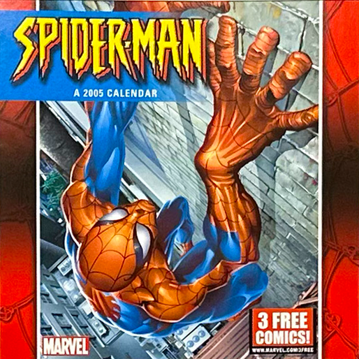
Marvel’s Spider-Man: wall calendar

Harry Potter: wall art decals

NASCAR - Dale Earnhardt: poster
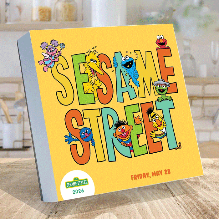
Sesame Street: daily page calendar
Licensed Product Design
Design work created within the brand guidelines of 30+ licensed properties — from initial concept and layout to final production art.
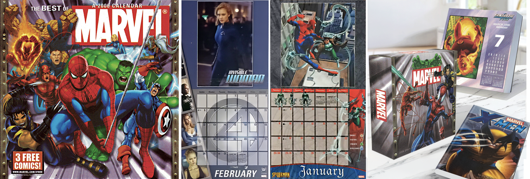
Marvel — Granted broad creative latitude to mix and collage from their large image archive; I handled image selection, fonts, and design.
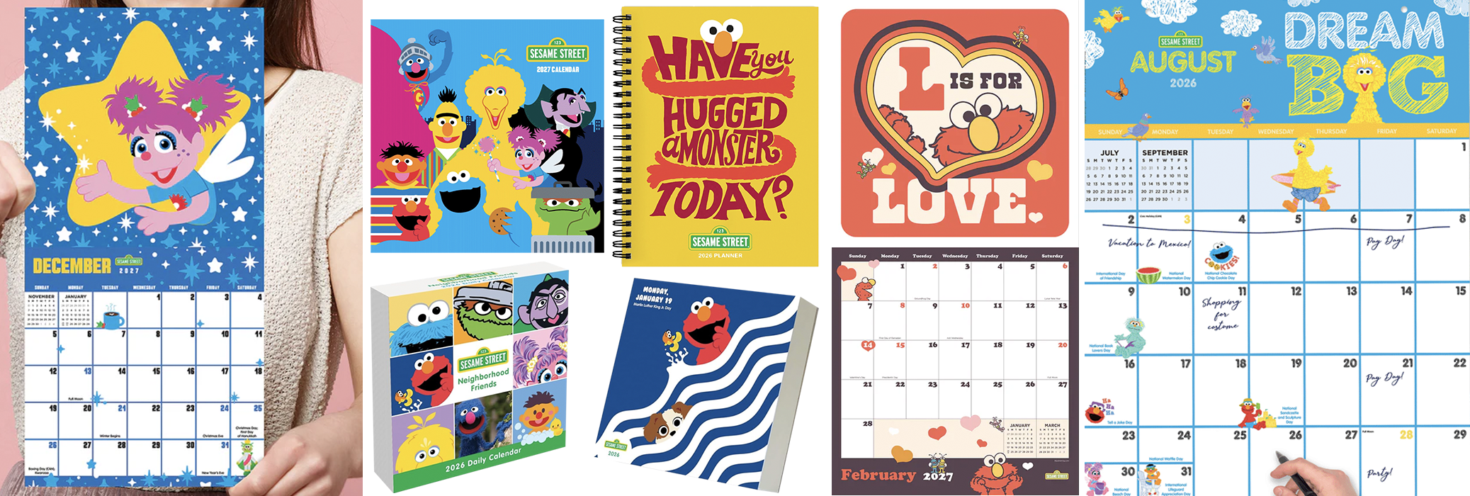
Sesame Street — Given creative freedom to select and collage images within each collection; designed the Abby Cadabby feature and one other in matching style.
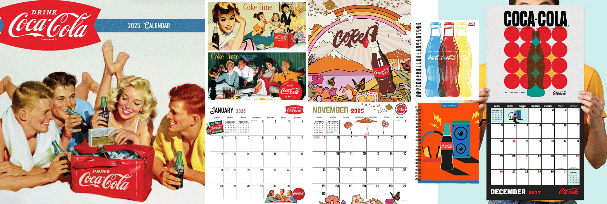
Coca-Cola — Given creative freedom for fonts, images, and original art design using their assets. A few examples, the blue, red, and yellow bottle covers came from one black vector bottle art. Also, only the bottle, logo, and "Coke" written in the soda were original — I created the rest to match.
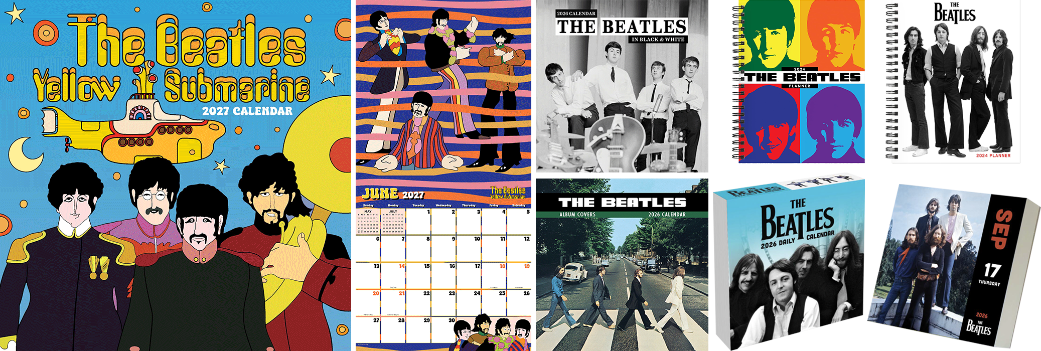
The Beatles — Given creative freedom for fonts, image selection, and using their assets. For example, the Yellow Submarine spread used their character art, and I added the stripe pattern to tie the elements together into a fun, playful spread.
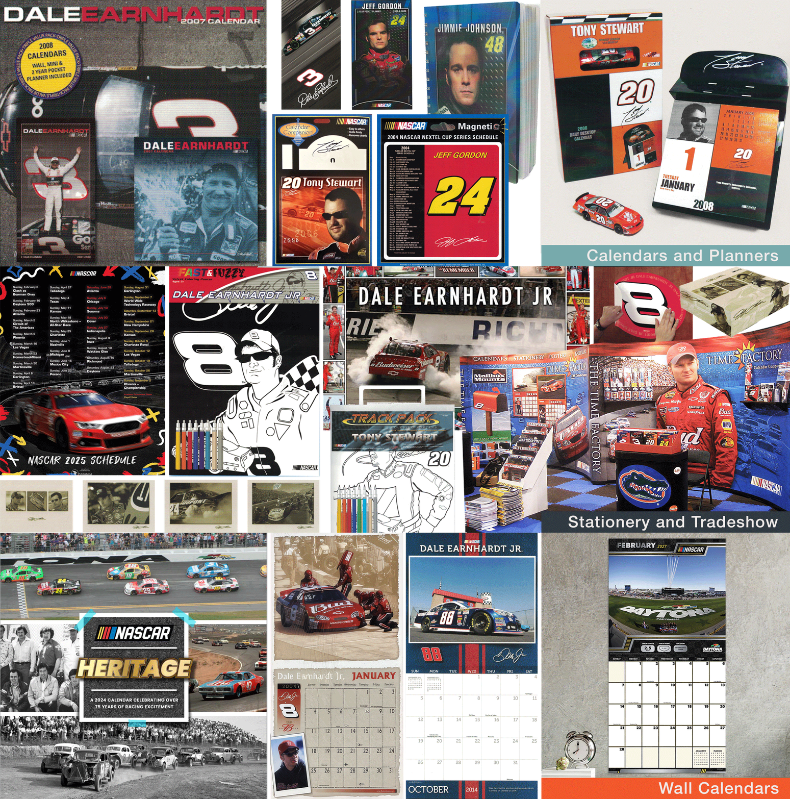
NASCAR | 20+ Products — NASCAR and race teams typically gave open creative direction; I chose the fonts, images (often via Getty Images), and overall appearance.
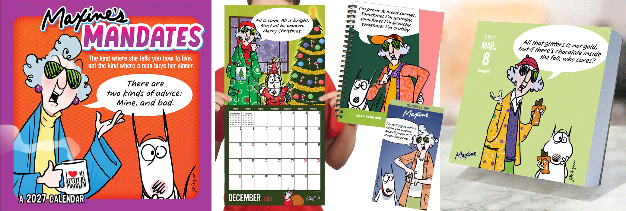
Maxine — One of Hallmark's licenses, Maxine's daily images were originally formatted for vertical greeting cards. I edited each image to fit a square page format and designed the calendar grid using Hallmark's standardized fonts. The grids and backs of the daily pages feature a wide variety of Maxine artwork collected from previous years.
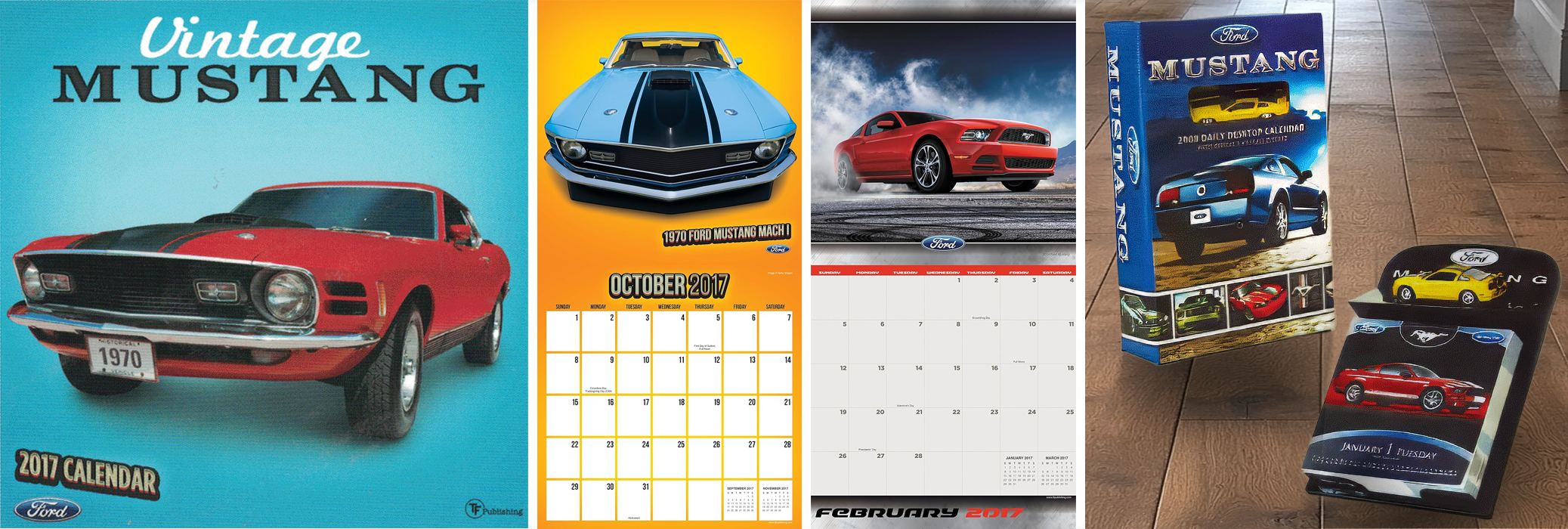
Ford Mustang — Given creative freedom to select the images, fonts, and overall design, I cut vintage Mustangs from dated, unappealing backgrounds and placed them against vibrant color backgrounds with added shadows for depth.
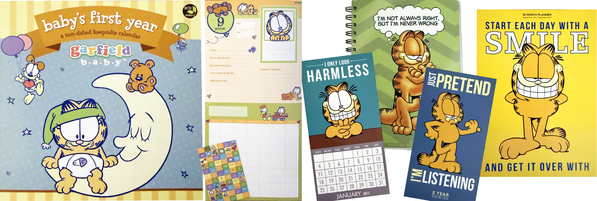
Garfield — Used existing character poses and added my own text, fonts, layout, and backgrounds. (Fun fact: I grew up able to see PAWS, Inc. — Garfield's studio — from my house, so it was especially enjoyable getting to work with them.)
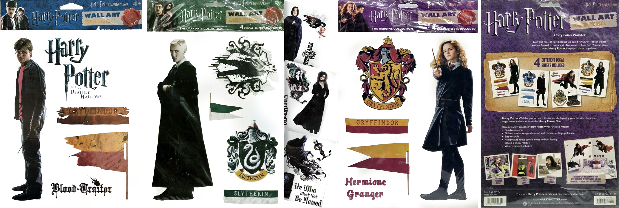
Harry Potter — Used licensed packaging guidelines to create an assortment of decal packs, including sample images of the product in use.
...and dozens of licenses beyond these highlights.
Systems & Production Design
Bridging operational efficiency with high-fidelity creativity — I build the systems that let design scale without losing quality.
Example One
Using Automation, Data Merge and Templates
Data Merge: I use InDesign Data Merge to auto-generate everything from carton labels to full daily calendars — turning a properly-tagged template and a CSV into a 300+ page document in seconds, accurately and error-free.
-
I try to utilize Data Merge, Actions, and Scripting to increase productivity — adapting and learning as I go. I'll focus on Data Merge here.
I commonly use Data Merges for:
Carton labels – title, format, item number, barcodes, UPC, quantity, and more, pulled consistently for every product. This prevents typos on those all-important numbers and makes proofing far easier.
Catalog items – entering product information for each item, keeping details easy to manage and consistent across the board.
Calendars – month, weekly, and daily setups. Few moments in design are as satisfying as clicking "Create Merge Document..." and watching a full daily calendar generate 300+ pages in seconds — dates, holidays, images, and colors falling perfectly into place.
Each data merge is tailored to its product line, with the layout following the product's own logic. Since every row corresponds to one page, a wall calendar's file is short but wide, a daily calendar is tall and narrow.
Setting up the initial file can look intimidating but becomes intuitive after a few attempts — and I've picked up plenty of tips for doing it efficiently.
Once a calendar's dates, holidays, and structure are proofed once, that same data file becomes the engine behind endless design variations — swap in a new background or style, and an entirely different calendar comes to life, all from one trusted foundation.
The Man Behind the Curtain
Setting up the InDesign file for Data Merge: Once a page design is set up properly, importing a data file and watching it populate hundreds of pages in seconds feels like magic — but the real trick is in how that file gets built.
-
Once you have a page design you love, set up properly*, it's time to import your tab-delimited text file (or CSV) and let the magic begin. Highlight the variable you'd like to change, then click the corresponding placeholder name in the Data Merge listing. Once all your variables are established, click the "Preview" radio button to see your final product, then use the arrows to page through each subsequent row of your data merge file.
*Setting up the file properly before merging:
Assign each grouping of text its own character style. For example, a calendar's dates, holidays, and days of the week should each have a distinct style.
Assign each grouping its own paragraph style in case adjustments are needed later, such as left, center, or right justification.
Establish a separate layer for each grouping, so you can easily select and recolor an entire group, like all the dates, at once.
Add optional layers for creative flexibility — should mini-months be white, black, or recolorable? Do you want picture boxes, grid lines, or a background color?
One Template, Endless Possibilities
Once a template is properly set up, the critical information is already locked in — freeing the designer to focus on limitless design options.
-
Perhaps the greatest advantage of this system is the creative freedom it unlocks. With the dates, holidays, and structural data already established and proofed once, that same data merge file becomes the engine behind countless design variations — as the sample grids above demonstrate. Swap in a new background, character style, or layer set, and an entirely different calendar comes to life, all built on the same trusted foundation.
That same data merge file isn't limited to one template, either. It can:
Power completely different calendar designs, from playful and whimsical to sleek and minimal, all pulling from the same proofed data.
Adapt to other product lines, giving designers a head start on new templates without starting from scratch.
Support customized calendars and planners, tailored to individual clients or specific themes with minimal rework.
Once the groundwork is properly laid, creativity is the only limit.
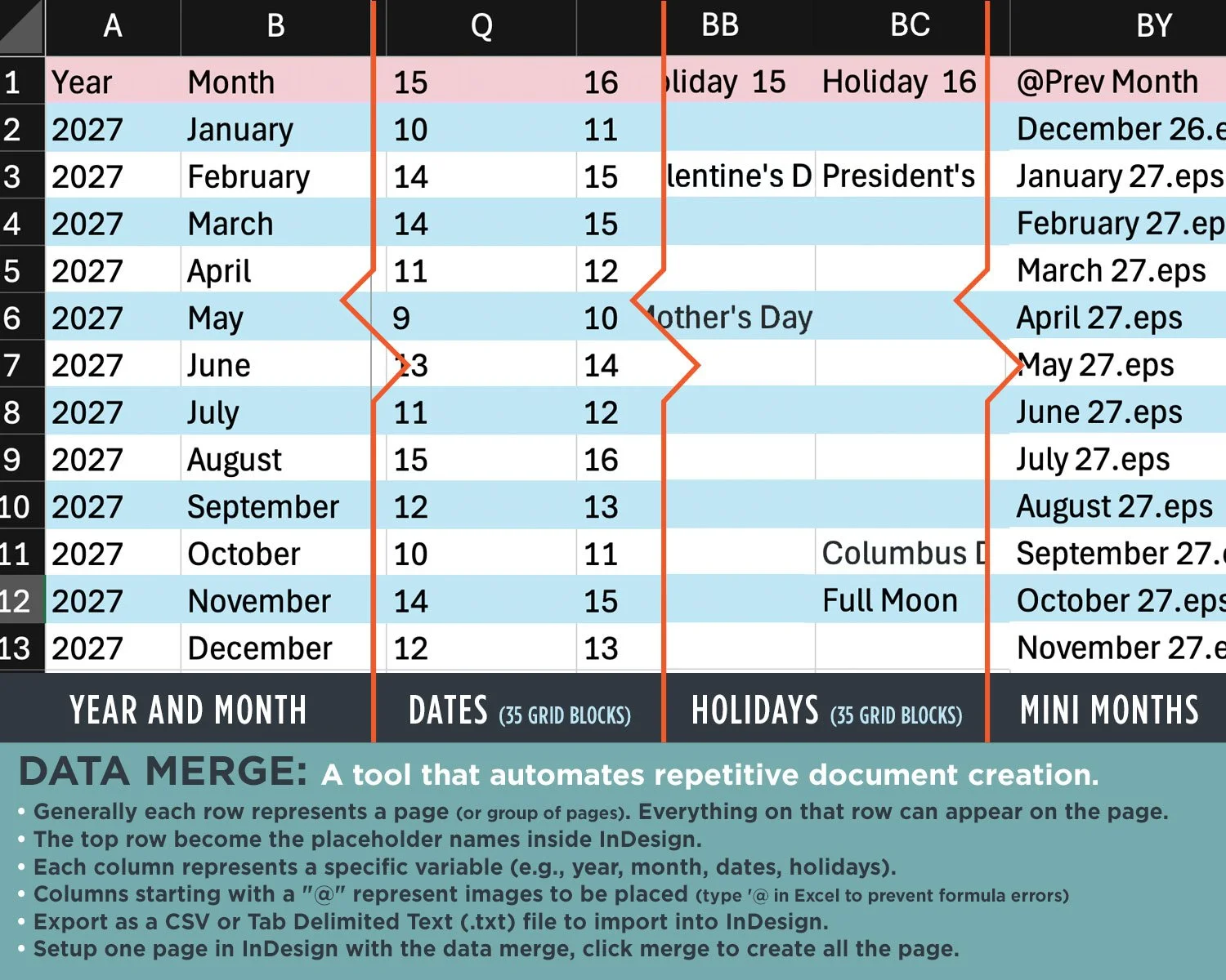
Sample file setup to save the tab-delimited text file or CSV to import into InDesign.
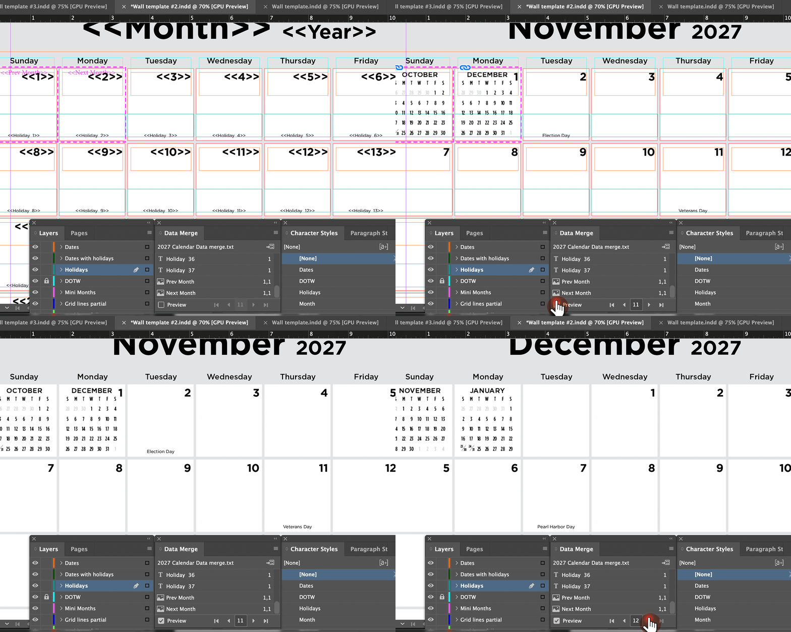
Sample file setup utilizing the Data Merge function in InDesign to form an art team template.
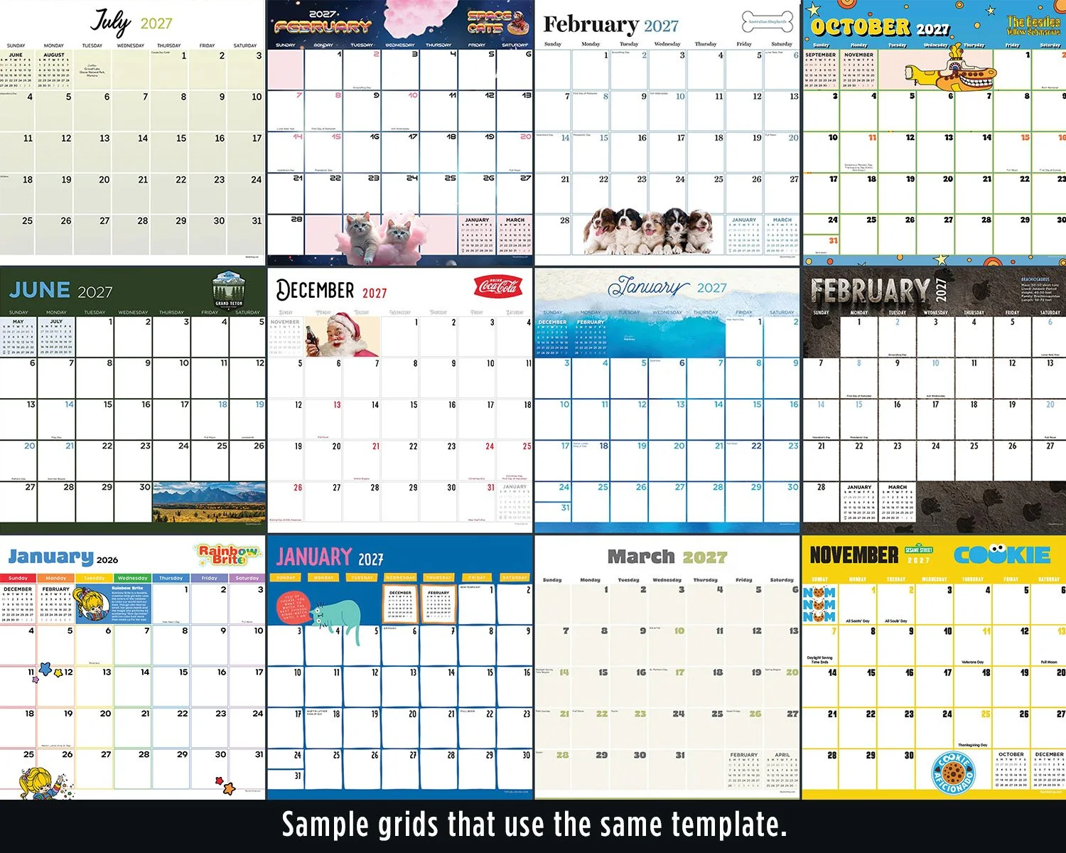
Each year, I managed the data merge process and built out the wall and mini calendar templates for the entire art team — a precise, adaptable baseline the whole team could build on. I also designed the majority of our weekly-monthly planner interiors.
Example Two
Bird's Eye View
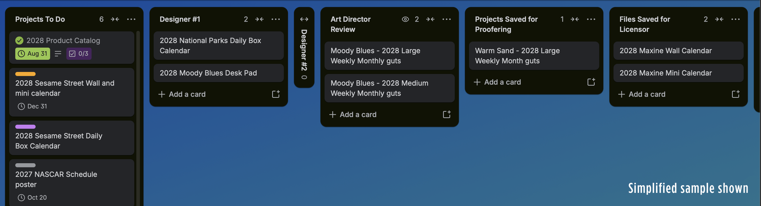
Project Tracking: I manage 400+ yearly products across designers, licensors, and approval rounds using a digital Kanban system — so at any moment, I can tell you exactly where any project stands.
-
As technology evolves, so should we. Originally, I used a large plotter and a wall lined with touchpoints tracking each product from concept through finished piece. But as our product count grew, that approach stopped being practical. Over a decade ago, I began researching project management software, and we landed on a free program that fit our needs perfectly.Instead of a physical board, I built out all of those touchpoints — and much more — into a digital one.
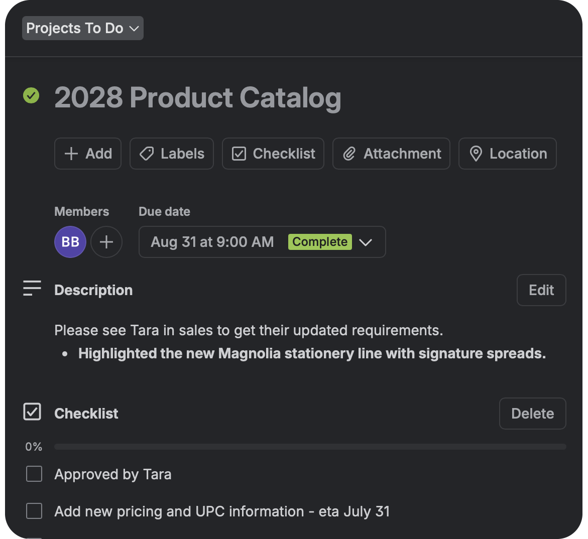
The key was breaking our process into manageable steps, with each column on the board representing a stage along the path to completion. Our first step was listing every product individually on its own "card" awaiting design. From there, we could add checklists, descriptions, inspirational images, due dates, and more. Whenever possible, I let designers choose which product they'd like to work on. A designer who's genuinely excited about their selection tends to be a happier designer — and happy designers make happy designs.
Each company’s process will be different. The first couple years our steps got adapted to what worked best for the team. After that, the steps have stayed basically the same.
Give me any of our 400+ projects, and a quick search tells me exactly where it stands.
Say the company decides to update pricing on a product line — no problem. I simply add a new "Update Pricing" column and drag every affected product into it. Once pricing is updated, each product continues down its original path, uninterrupted.
Different companies have different needs, but I've found these features especially useful:
All information stays with each project – descriptions, checklists, PDFs for review, and related communication, all in one place.
Automatic notifications and reminders
Due dates established as soon as a project is created
Time- and date-stamps on everything
Keeping Printers in Sync
Status tracking didn't stop at our team — printers around the world, often communicating in a second language, needed the same clarity. A simple shared status sheet kept every file, proof, and approval accountable, and saved real money whenever a deadline was disputed.
-
Not only did I need to know the status of each product — the commercial printers needed to know as well. Over the years, I developed a process to communicate clearly with printers, many of whom didn't speak English as a first language. Clear specifications and organized file management were essential, but tracking revisions and approvals mattered just as much, especially with products moving through printers around the world.
As part of our quoting process, each printer agreed to maintain an updated Excel status sheet with every email, highlighting any new information. It tracked the date of each step: files sent, proofs received, revisions, final print approval, and advance sample approval. Simple as it was, this habit saved us real money whenever a printer claimed a file hadn't arrived on time.
The sheet also served as a quick reference for critical details — like wire-o color per grouping, or the exact interior pages and sticker to use by file name — leaving no ambiguity about what each product required.
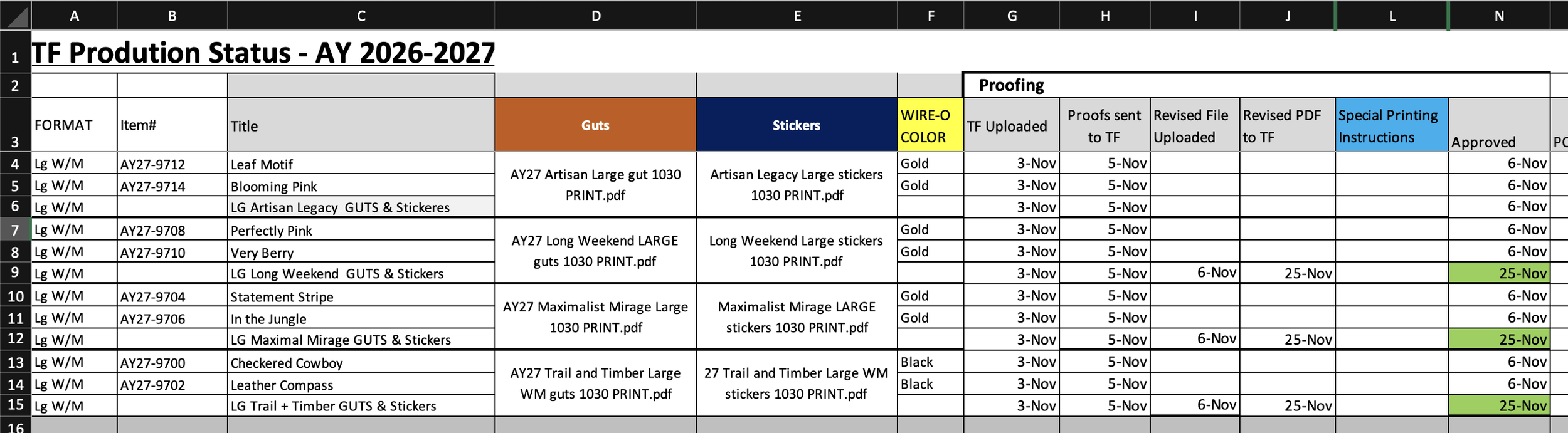
Sample "Status Sheet," updated with every printer communication to track files, proofs, and approvals.
Retail Graphics
The symbiotic relationship between Art and Sales — I designed the materials that helped sales teams win shelf space and close programs.
-
They say no man is an island. In business, it might as well be "no department is an island" — and nowhere is that truer than in the relationship between art and sales. Simply put: designs design, sales sells the designs, art helps sales look their best. Our design team didn't just create the product designs; I also worked directly with sales to make sure every presentation represented the brand well. Anyone who's sat through a sales pitch has seen what happens when the sales team could have used a little help from design.
I typically supported sales with:
Sales materials — catalogs and ads, both print and digital
Displays — built to pitch a program for consideration, then refined for exact product placement in final production
BLADs (full-size front and back covers) — used by buyers to plan physical store planograms
Retailer images — formatted to each retailer's own specs and naming conventions, across dozens of accounts
This section focuses on catalogs and displays — the two I owned almost exclusively.
Displays: A Picture is Worth a Thousand Words
The right image can be worth thousands of dollars
Displays: Designed ~95% of our displays over 10 years — compressing full product lines into a single image a buyer can understand in seconds, functioning as both the initial sales pitch and the final production blueprint.
-
A display has to do two very different jobs and look effortless doing both. First, it's a pitch — the visual that convinces a buyer to say yes to a program before a single unit exists. Then, once that program is approved, it becomes something else entirely: a working blueprint, dialed in to the exact product placement and layout that goes to final production. Most sales tools only have to do one of those jobs. A display has to do both, for the same audience, without looking like two different documents.
I've designed roughly 95% of our displays over the past 10 years, and what that work really comes down to is translation — taking an entire product line, sometimes dozens of SKUs deep, and compressing it into a single image a buyer can understand in seconds. Scale, hierarchy, sightlines, what sits at eye level and what doesn't — all of it has to read instantly, because a buyer isn't going to study a display, they're going to glance at it and make a call. That's the part of the idiom that's easy to forget: it's not just that the picture says a thousand words, it's that in a room where a program lives or dies on a single pitch, the right one closes the deal.
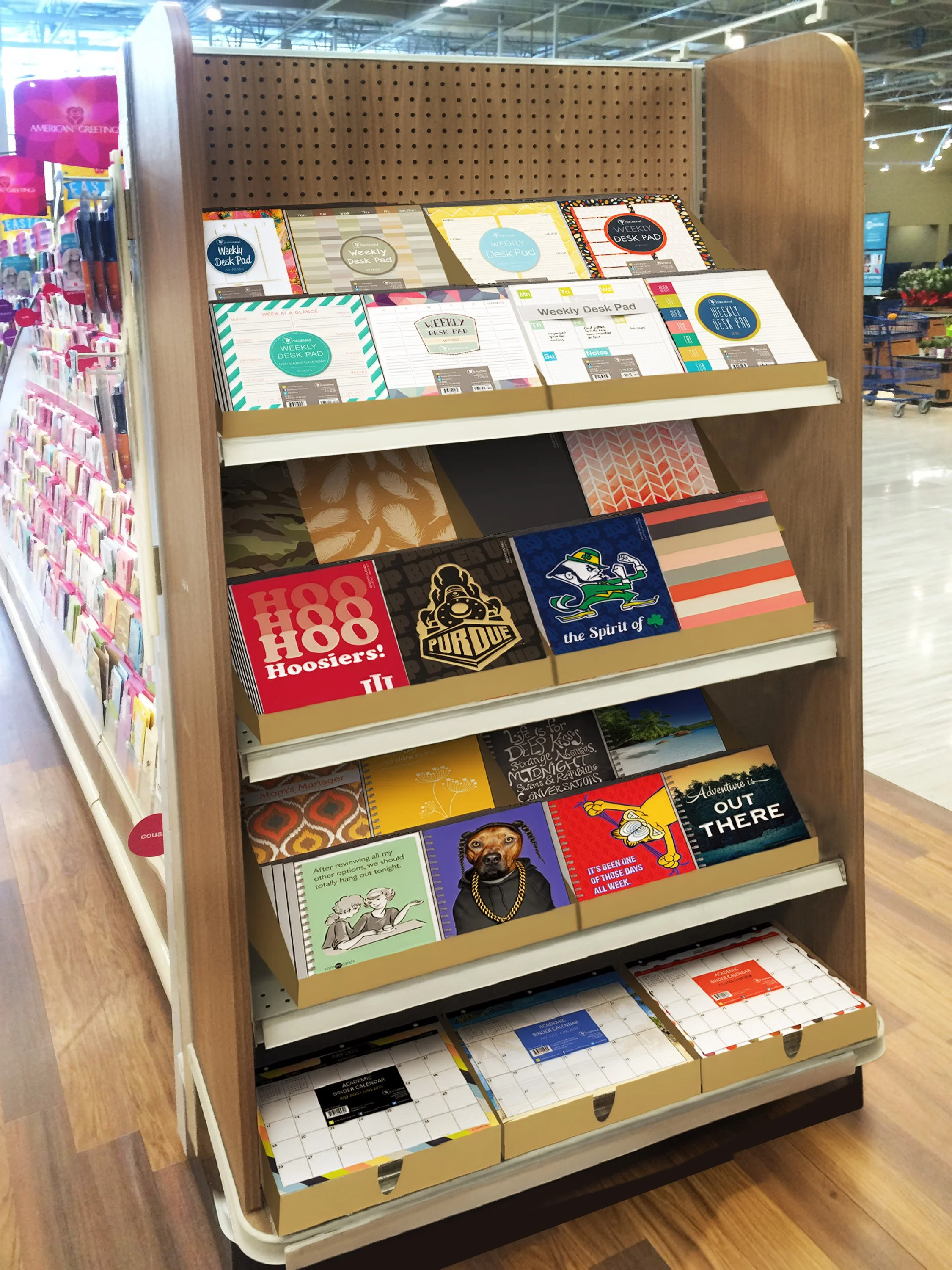
Endcap program, in-store mockup
A Photoshop composite showing the proposed endcap in its actual retail environment — letting buyers see exactly how the program would look on their floor before a single unit was produced.
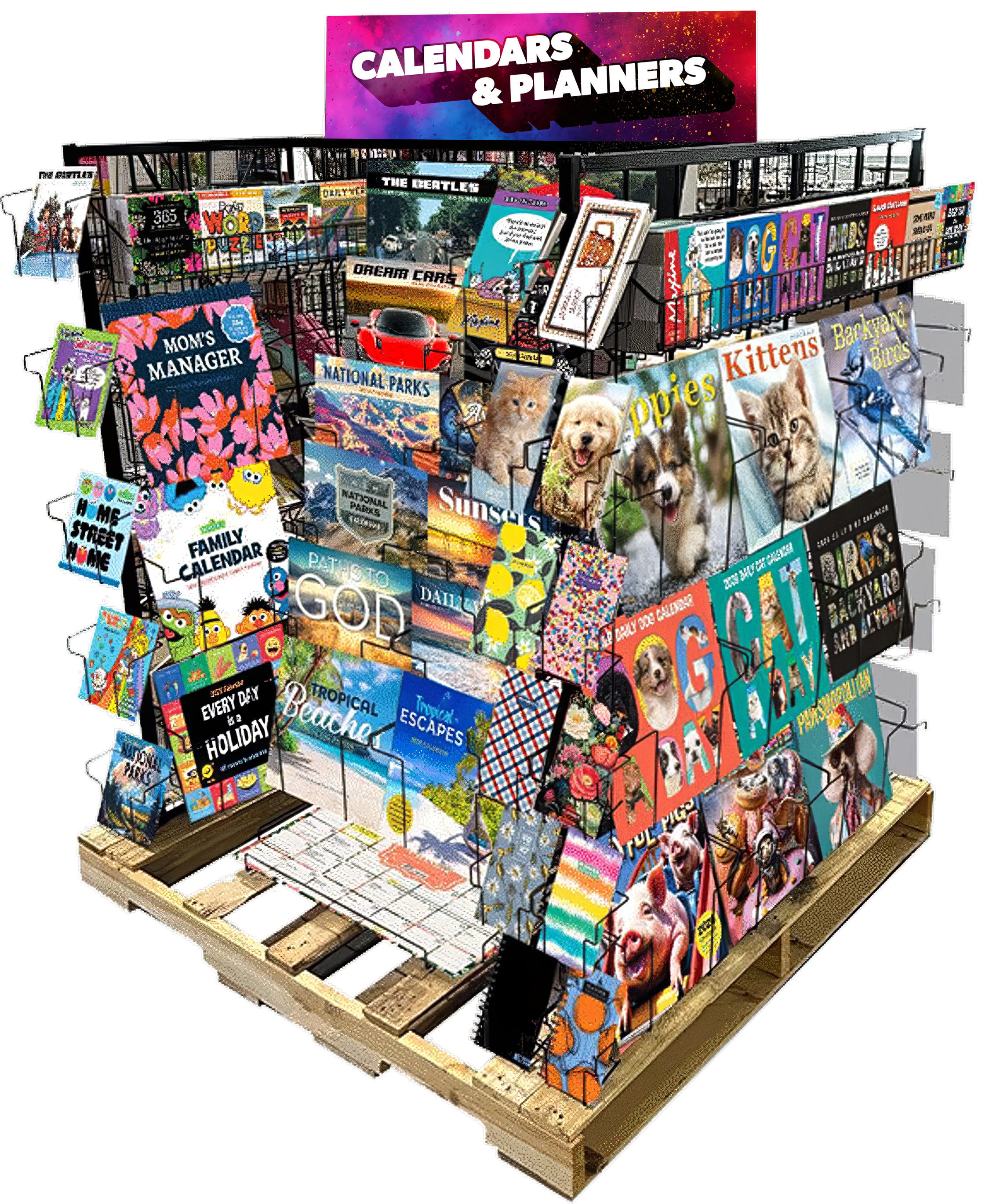
Full pallet program, product line mockup
Dozens of titles across a dozen-plus categories, composited onto the actual wire rack and pallet — the whole assortment made readable in a single glance, the same way a buyer would see it on the floor.
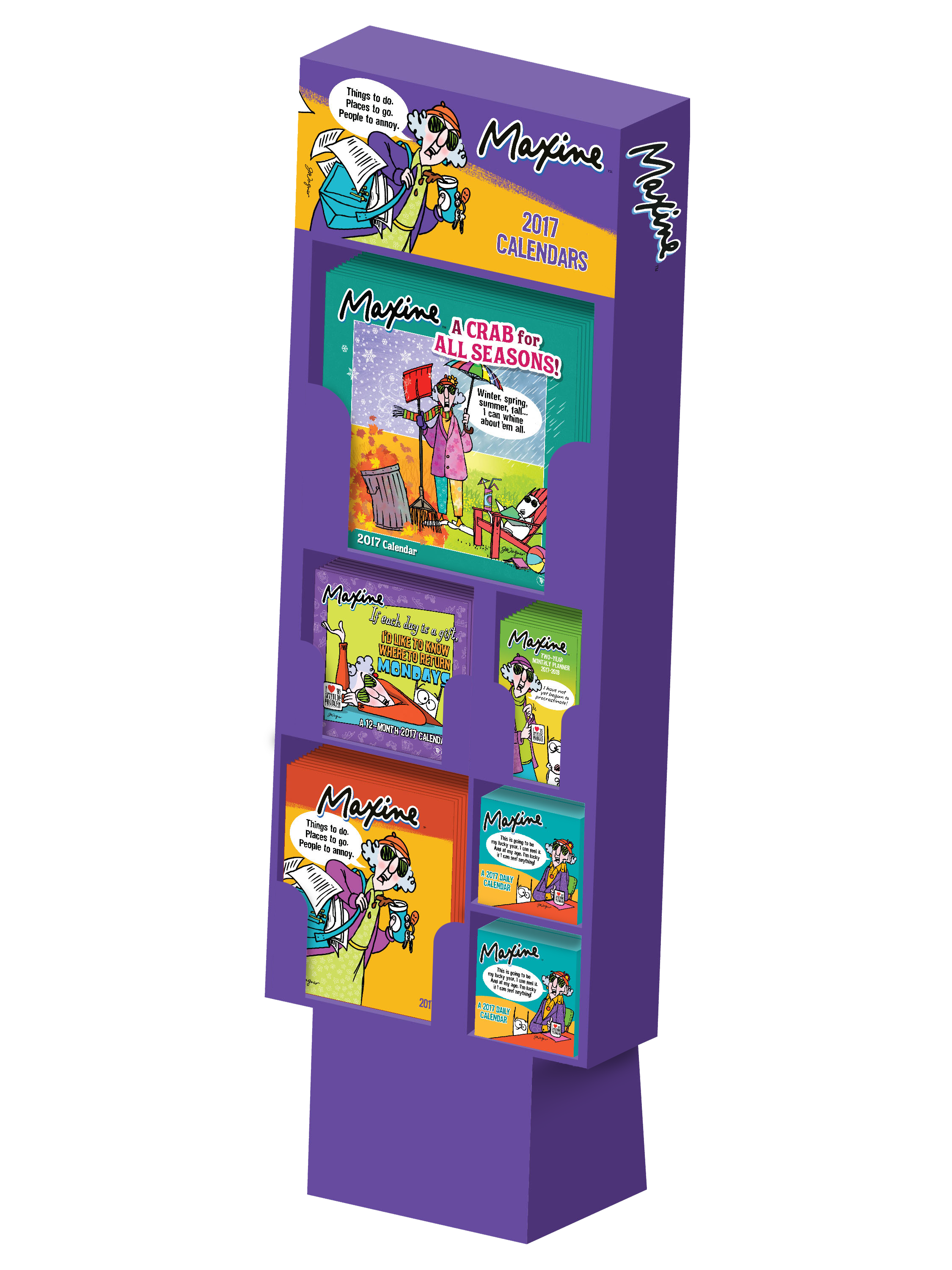
Maxine license display,
single-brand mockup
Where the full pallet shows breadth across categories, this composite shows depth within one license — the Maxine line merchandised as a standalone program with its own cohesive shelf presence.
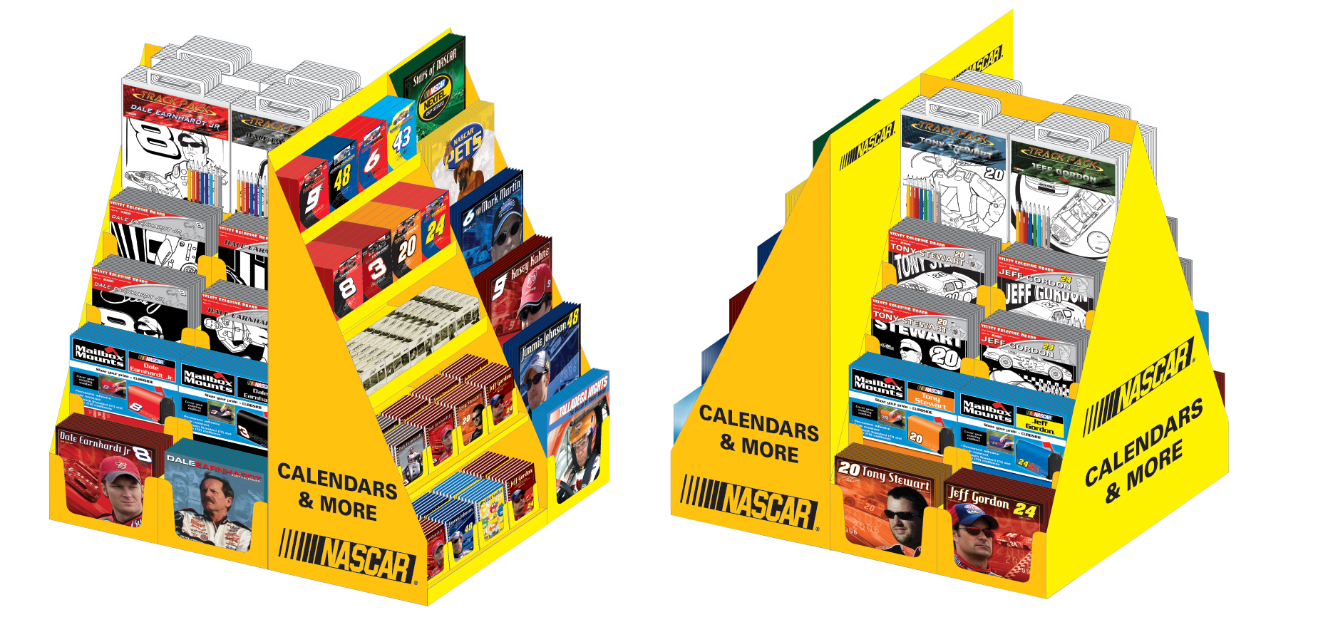
NASCAR Licensed Full Pallet Planogram
Rendering of a full pallet display showing where each title should appear in-store.
Catalogs: Don't Judge a Book by Its Cover
Except buyers do — on every single page
2020 Calendar Year catalog, 180 pages
Cover to cover, including an assortment of non-dated titles in the back — one confident pitch the whole way through.
Catalogs: Built our Calendar Year, Academic Year, and Non-Dated catalogs from the ground up, up to three times a year — hundreds of SKUs balanced to feel distinct yet cohesive, so the whole book reads as one confident pitch.
-
A catalog has a much bigger job than a display, and a much smaller amount of trust to earn it with. Where a display gets a shopper walking past a fixture, a catalog gets a buyer sitting down with a stack of them from every vendor competing for the same shelf space — and it has to hold their attention on its own, page after page, with no salesperson standing next to it to fill in the gaps. Up to three times a year, I built that catalog from the ground up: one for Calendar Year products, one for Academic Year, one for non-dated and stationery — each with its own launch window, its own assortment, and its own case to make.
What ties all three together isn't the products, it's the discipline: hundreds of SKUs, each one needing to look distinct enough to sell itself and consistent enough to feel like part of the same line. A buyer flipping through has to find what they're looking for fast, understand what's new at a glance, and never once feel like they're looking at a spreadsheet with pictures. That's the real test of a catalog — not whether any single page looks good, but whether the whole thing reads as one confident pitch, product after product, three times a year, without ever repeating itself.
2027 Calendar Year catalog, 130 pages
The full catalog, live — flip through it below the same way a buyer would, cover to cover.
Original and Independent Design
Work where the concept, direction, and execution were entirely mine — no brand guidelines but my own.

C.S. Lewis Lion (Aslan) — Hand-drawn lion in colored pencil on colored paper (20" x 30"), Created for a C.S. Lewis enthusiast.
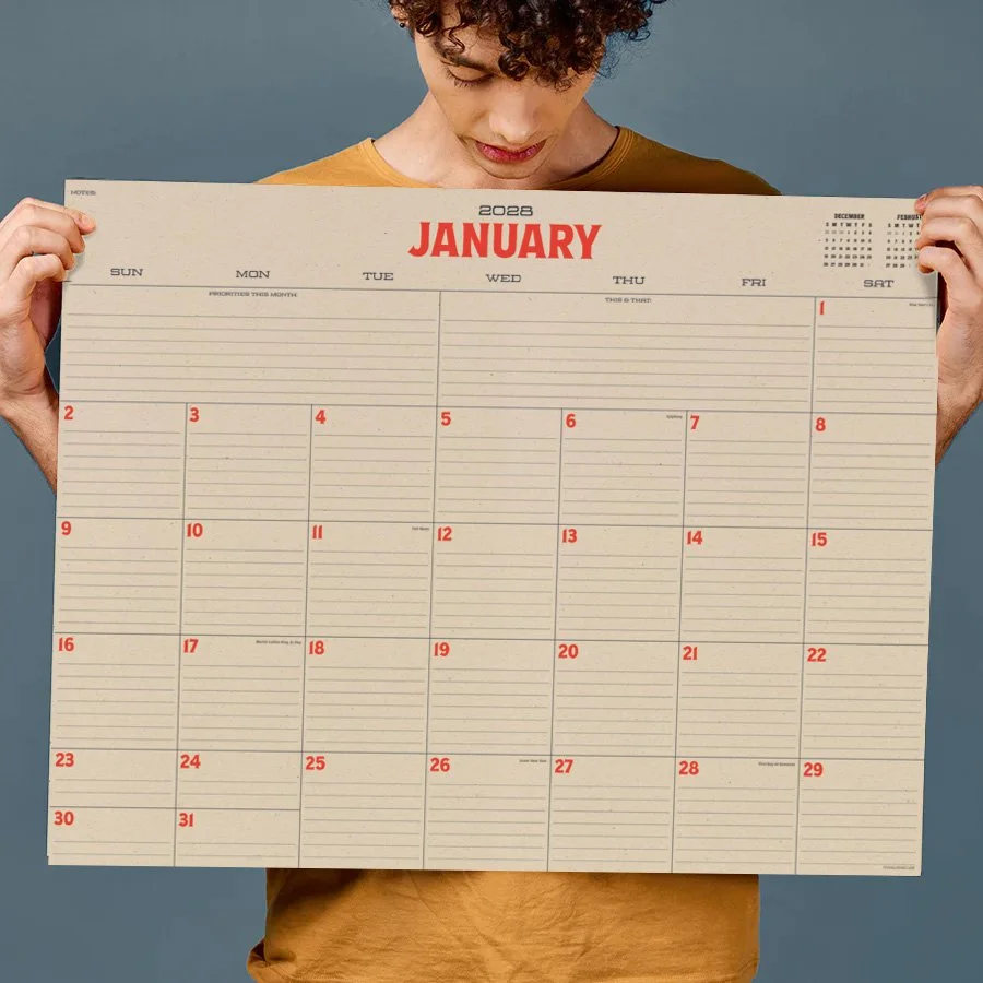
Large Desk Pads — 22" x 17". Simple, clean, and makes good use of the space.
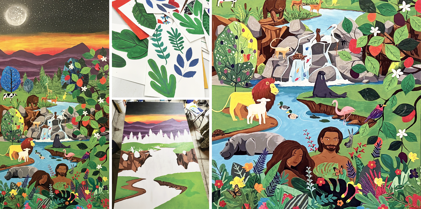
The Mural Collage Project – An intergenerational project designed to foster teamwork; pictured is panel 1 of 4 (4' x 8'). Participants aged 2–85 painted individual paper elements, which were cut and layered onto a shared acrylic background.
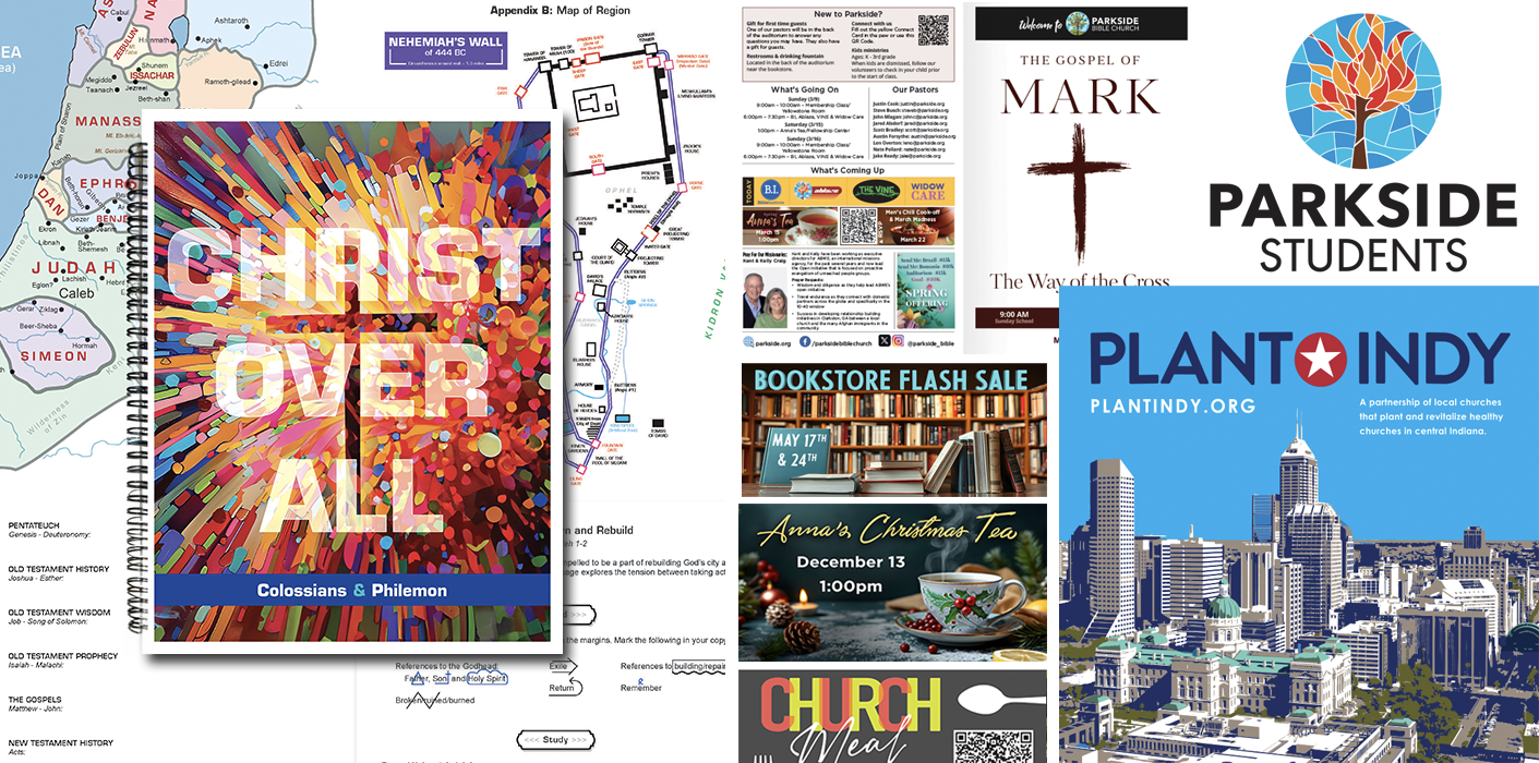
Local Church — Created 100+ page Bible studies books with drawn maps, plus weekly adult and kids’ bulletins, logos, backdrops, series graphics and slides.

AI Generation Tools — Concept, direction, and final curation by hand — imagery generated with AI tools.

Small Business Logo — Designed a logo based on client criteria: a saw blade outer circle paired with a house.
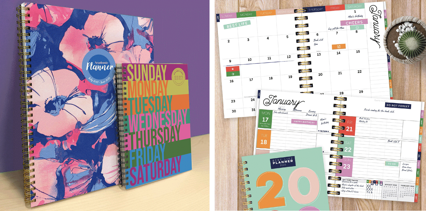
Weekly & Monthly Planners — Composed 200+ gut layouts for weekly and monthly planners to match the style of each collection. Also created 1000+ cover designs.
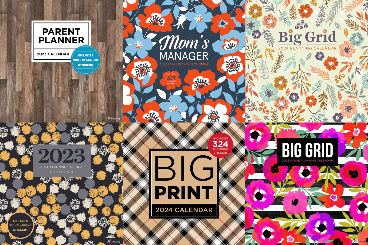
Design Oriented Covers — Imagery hand-selected and curated to drive the design direction for each planning calendar.