
Design Portfolio
More than 2,500 commercial products designed across licensed brands, original concepts, and consumer product formats.
Throughout my career, I remained a hands-on designer while leading the creative team. My work ranged from calendars and planners to displays, catalogs, and new product concepts, while I also helped guide hundreds of products through development each year.
Much of that work involved continually reinventing successful products. Long-running titles returned year after year, requiring fresh creative solutions while maintaining the qualities that made them recognizable and marketable.
Featured Licensed Work
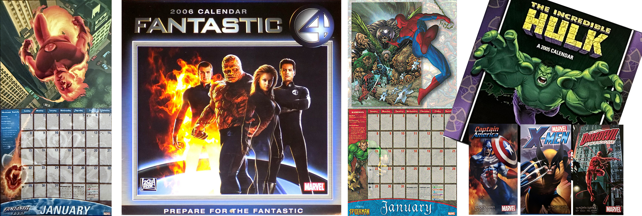
MARVEL
Designed licensed calendars and planners across Marvel properties and characters, adapting extensive image libraries into a wide range of product formats. Projects included movie, comic, and character-based titles, requiring compositions built from supplied assets while maintaining each property’s distinct visual identity.
For the Fantastic Four movie calendar, worked with pre-production imagery before final visual effects were established, including carefully adjusting the transparency of the Invisible Woman.
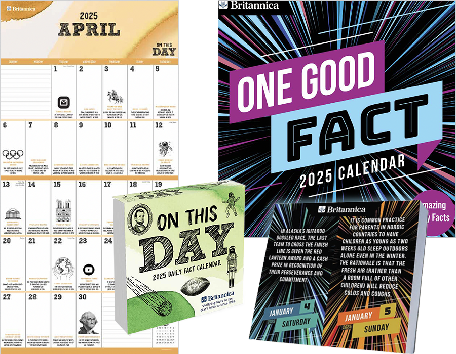
BRITANNICA
Working from Britannica-supplied facts and branding, I developed the visual direction and design for each calendar from the ground up. I sourced and adapted imagery and illustrations to support the content, creating distinct visual identities while balancing editorial information, typography, and calendar functionality.
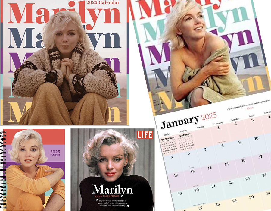
MARILYN MONROE
Designed calendars and planners that balanced iconic Marilyn Monroe photography with typography, color, and editorial elements to create distinct treatments across formats. Graphic elements, including period-inspired stripes, helped integrate older archival imagery into the designs, while selected products incorporated quotations to bring another dimension of her personality to the photography.
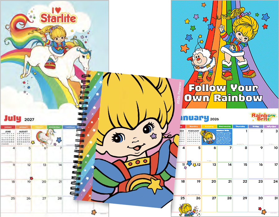
RAINBOW BRITE
Designed licensed Rainbow Brite calendars and planners using approved character artwork, colors, and brand elements. Developed distinct collections using both newer vector artwork and classic scanned imagery, adapting the different visual styles while maintaining the property’s recognizable playful, colorful identity.
NCAA
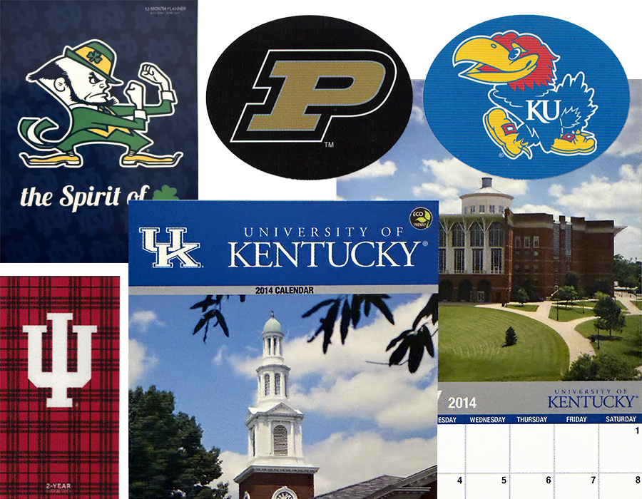
Designed collegiate calendars, planners, and repositionable graphics across numerous universities, adapting school photography, colors, logos, mascots, and other approved assets across distinct product formats while preserving the identity of each institution.
The selected examples represent multiple schools, conferences, and product formats from the broader collegiate program.
THE BEATLES
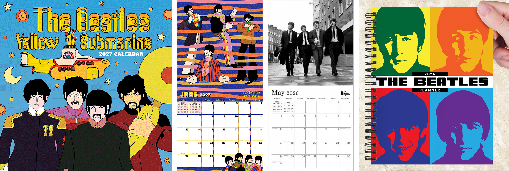
Designed wall calendars, planners, and daily calendars using both photographic and illustrated Beatles assets. Worked within varying image availability and licensing restrictions while creating distinct visual approaches across formats and years.
For the illustrated Yellow Submarine calendar, combined four separate character illustrations with overlapping, interwoven bands of color to create a unified composition consistent with the psychedelic visual style.
NASCAR
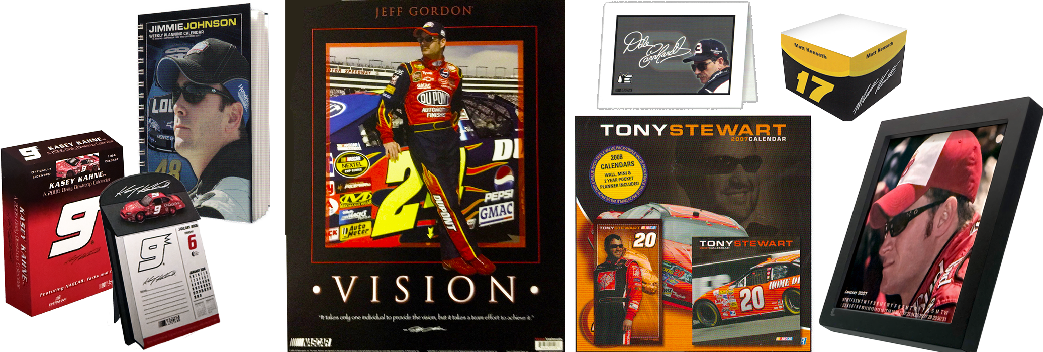
Designed hundreds of licensed NASCAR products across more than 20 drivers during a long-running program spanning more than two decades. Work extended well beyond calendars to stationery, posters, note cubes, desktop products, displays, and specialty formats.
Products shown demonstrate the breadth of the program—from a die-cast desktop calendar and reusable desk frame to a 22" × 28" poster, stationery, note cube, planners, and multi-format value packs.
PETERSON FIELD GUIDES
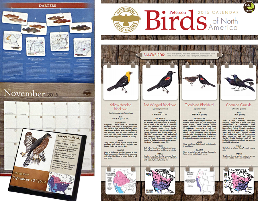
Translated information-rich Peterson Field Guides content into calendar formats that balanced reference material with functional planning. Designs organized illustrations, identification details, maps, descriptions, and supporting information into clear visual systems that remained useful at calendar scale.
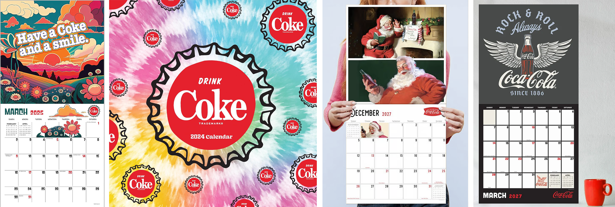
COCA-COLA
Designed licensed calendars and planners across vintage, contemporary, and lifestyle-driven Coca-Cola collections, translating approved brand assets into cohesive products while maintaining strict logo, trademark, and color requirements.
Selected examples highlight original compositions created from approved Coca-Cola marks and supplied assets, including custom backgrounds, supporting imagery, calendar grids, and product-specific graphic treatments.
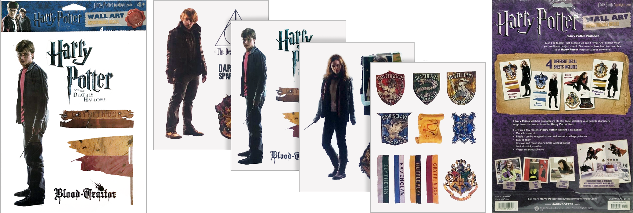
HARRY POTTER
Designed licensed wall decal collections using approved imagery and brand assets, translating the visual world of Harry Potter into decorative consumer products while maintaining detailed licensing and brand requirements.
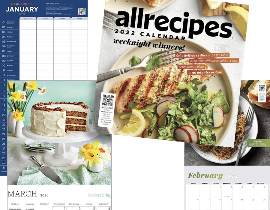
MEREDITH BRANDS
Designed calendar products across multiple Meredith publishing brands, including allrecipes, Real Simple, and Southern Living. Translated each publication’s distinct editorial identity into calendar formats while adhering to rigorous brand and editorial standards that extended throughout each product, from photography and typography to recipes, editorial content, and planning features.
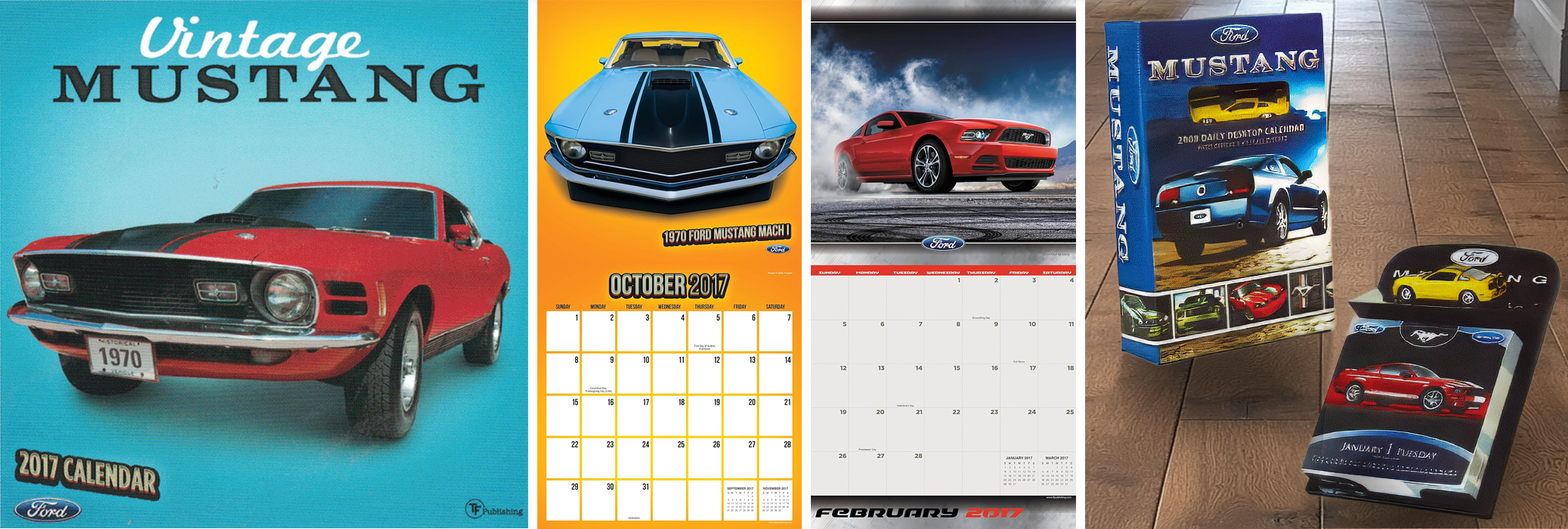
FORD MUSTANG
Designed licensed Mustang calendar products around automotive photography and brand assets, using bold typography, structured layouts, and performance-oriented graphics to complement the character of the vehicles and their enthusiast audience.
Vintage Mustang: Archival vehicle photography was isolated from dated backgrounds and rebuilt with vibrant new environments and realistic shadows, creating a refreshed presentation while retaining the character of the classic cars.
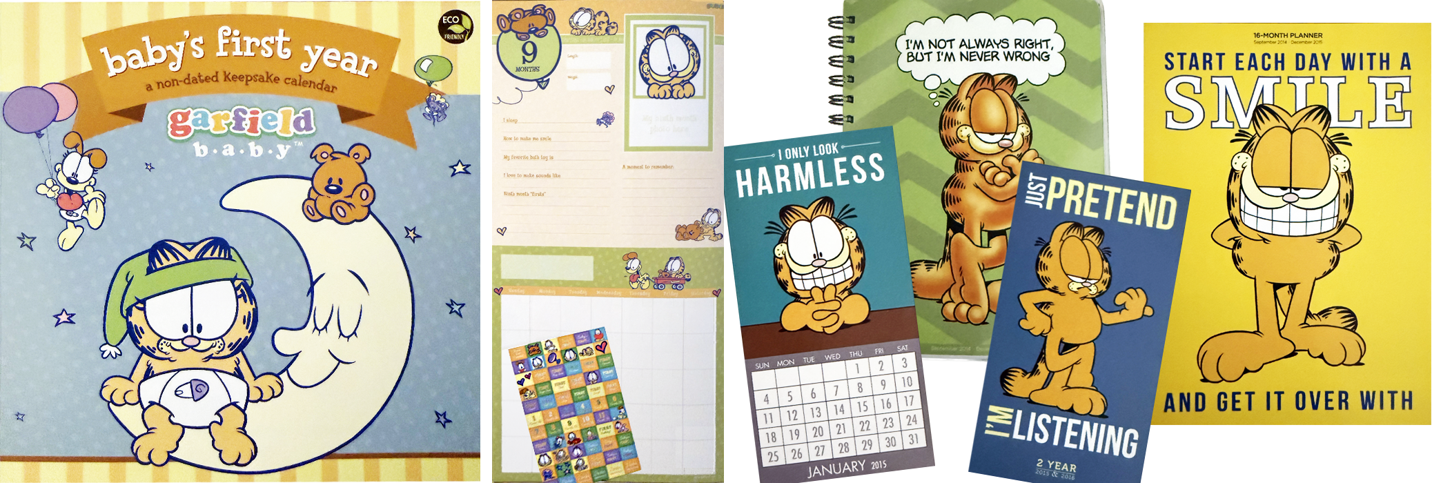
GARFIELD
Designed licensed Garfield products across multiple formats, expanding the property beyond traditional calendars into planners and additional product concepts. Work included adapting supplied character artwork to different proportions, formats, and audiences while maintaining the established Garfield visual identity.
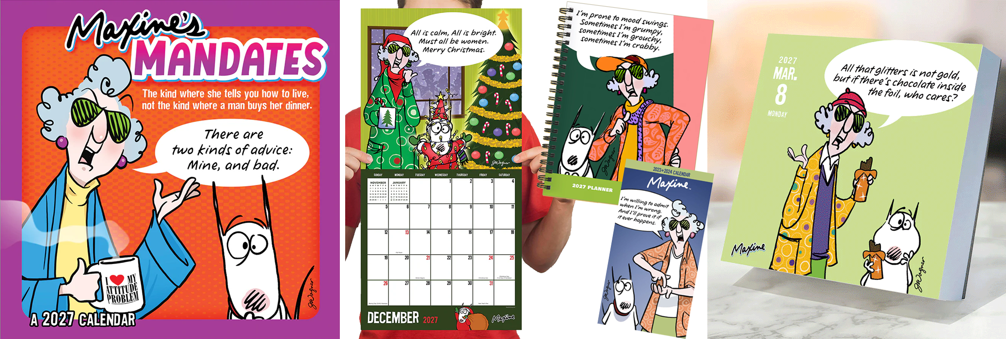
MAXINE
Adapted Hallmark’s Maxine artwork across calendar and planning formats while preserving the humor and personality of the original illustrations. Artwork often required thoughtful reformatting to accommodate square and other product proportions without compromising the featured illustration or message.
For daily page formats, compositions were extended, cropped, or rebuilt as needed to successfully translate greeting-card artwork into a new format.
PEPSI
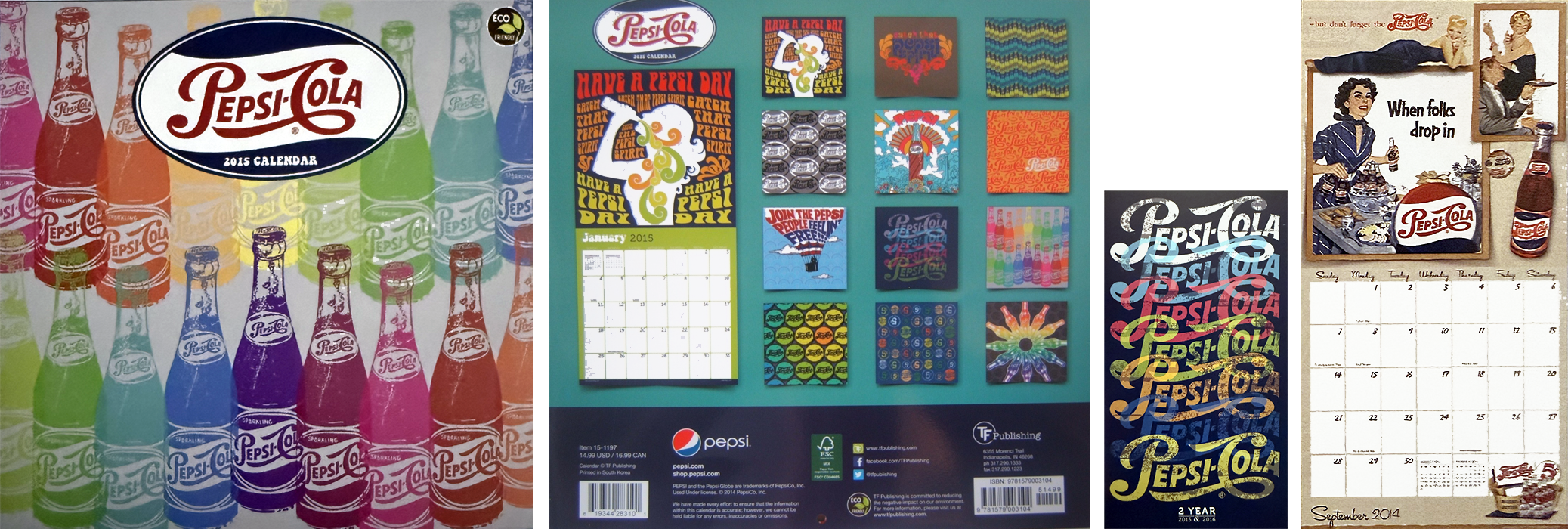
Designed licensed Pepsi calendars using the brand’s extensive historical artwork and identity, creating products that ranged from vintage-inspired treatments to colorful contemporary compositions.
Selected work includes a rainbow bottle composition created by repeating a single supplied bottle image and using color and transparency to transform it into a vibrant pattern.

+ AND MANY MORE LICENSED BRANDS +
Featured Original Work
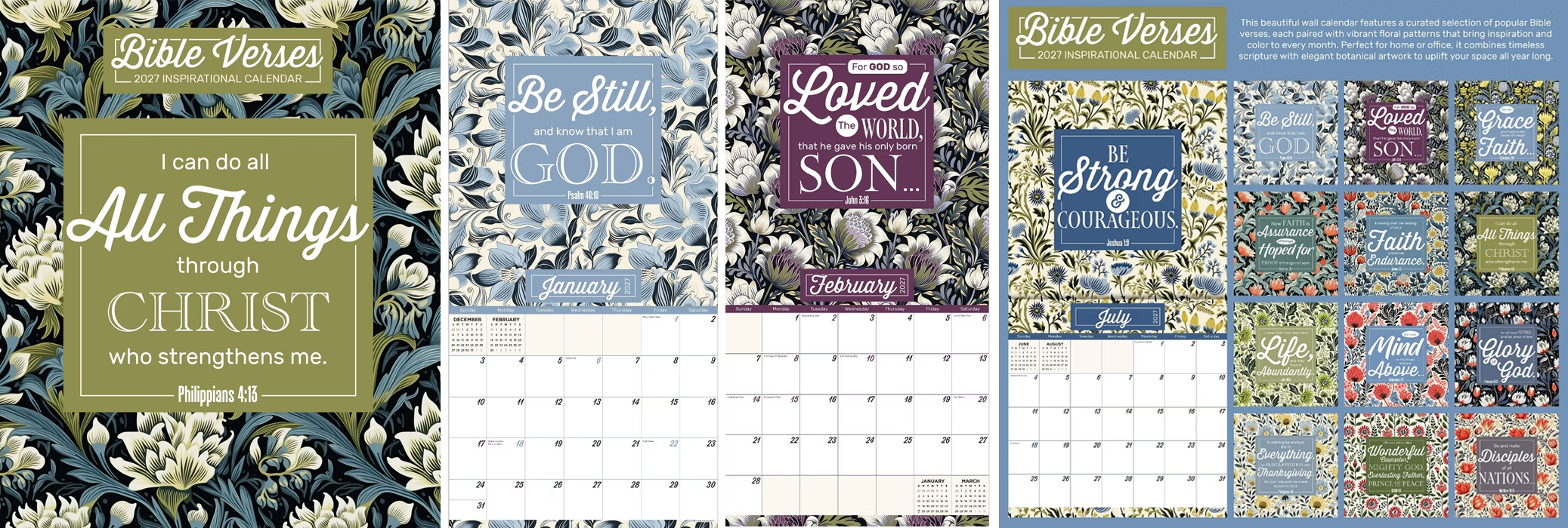
Original product design developed for TF Publishing's in-house product line, spanning concept development, visual design, content creation and production systems.
BIBLE VERSES
Developed this calendar from a request for a floral inspirational title, taking the product from initial research through finished design. I identified a contemporary public-domain Bible translation, researched widely recognized verses, selected and coordinated floral artwork, established the color palette, and developed a typographic treatment that turned each verse into a visual composition rather than simply placing text over an image.
I designed approximately 17 verse treatments before selecting the strongest 13 for the finished calendar, then adapted an existing calendar format to integrate the floral artwork, typography and color throughout the monthly grids.
The calendar was designed as a complete year rather than 12 independent pages. Verse themes, floral colors and seasonal associations helped determine placement—from cool blues in January and “Loved” in February to gratitude in November and red and green paired with a Messianic verse for December.
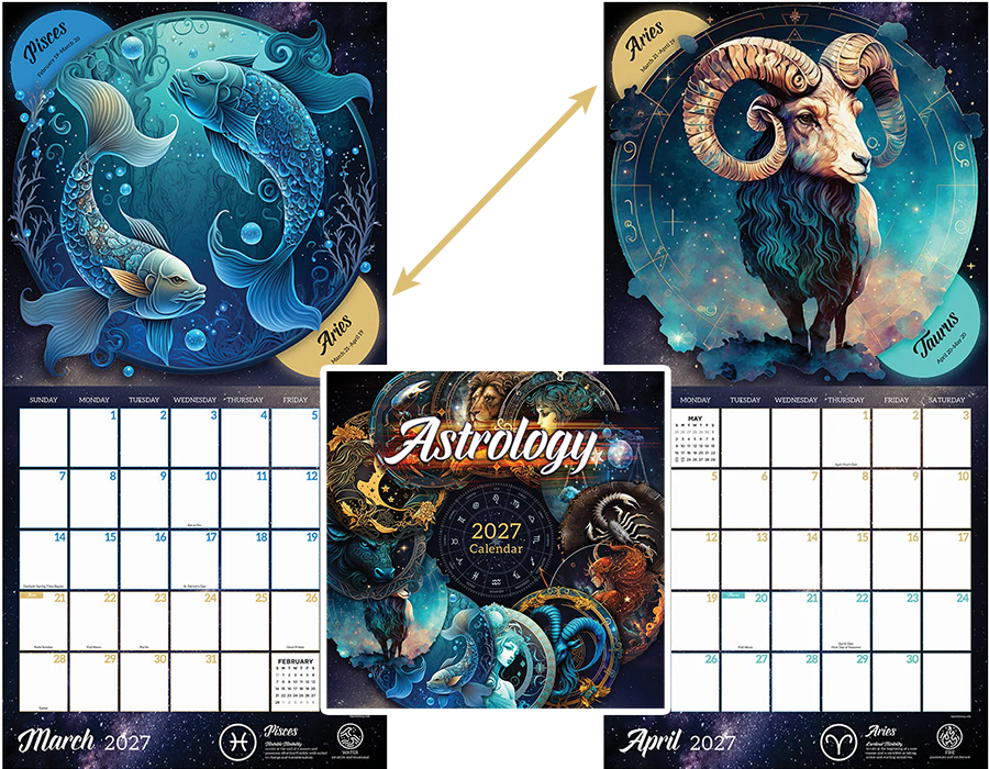
ASTROLOGY
Turning Complex Information into Visual Design
Developed a new visual approach for the Astrology calendar after an earlier edition featured licensed artwork. The new version ultimately outsold the licensed-art edition and has continued as part of the line.
Because zodiac signs change partway through each month, I created a system that communicates the transition through the artwork and grid, using shifting date colors, grid outlines and transition markers to distinguish each sign.
Colors coordinate with each month’s artwork and adjacent zodiac signs, creating a continuous visual system across the year.
KRAFT DESKPAD
Designed for function
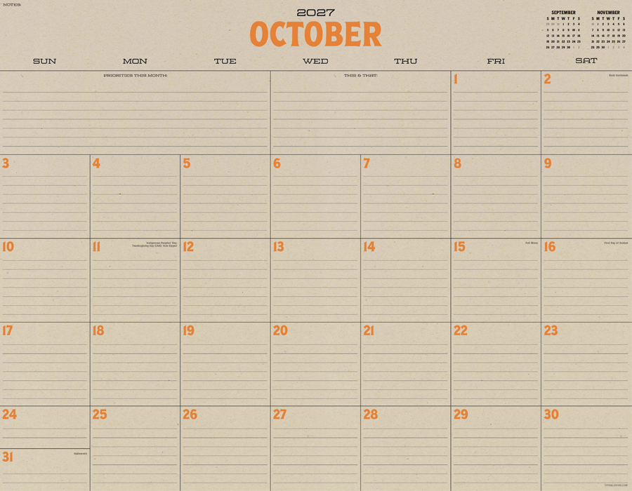
Designed a 22" × 17" kraft desk-pad calendar around simplicity, organization and maximum usable writing space. The layout incorporates lined date boxes, previous and next mini-months, and dedicated areas for priorities, notes and “this & that,” while maintaining a clean visual hierarchy.
A single accent color changes throughout the year, with colors selected to complement the season—such as orange for October—adding personality without competing with the calendar’s primary function.
PLANNER COVERS
Designing from Scratch
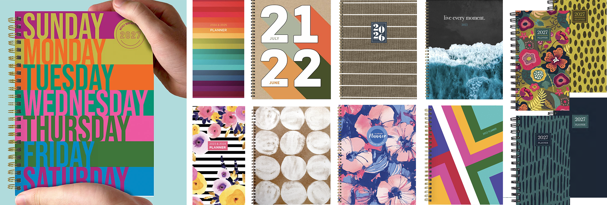
Created original planner cover concepts across multiple formats and market styles, using typography, pattern, color and composition to establish distinct visual identities without relying on licensed artwork.
Selected designs also demonstrate coordinated merchandising systems, with shared palettes and visual elements developed across multiple covers intended to display together at retail.
The featured seven-stripe cover transforms the seven days of the week into the primary graphic element, combining the product’s function with its visual identity.
PLANNER INTERIORS
Evolving a Successful Design
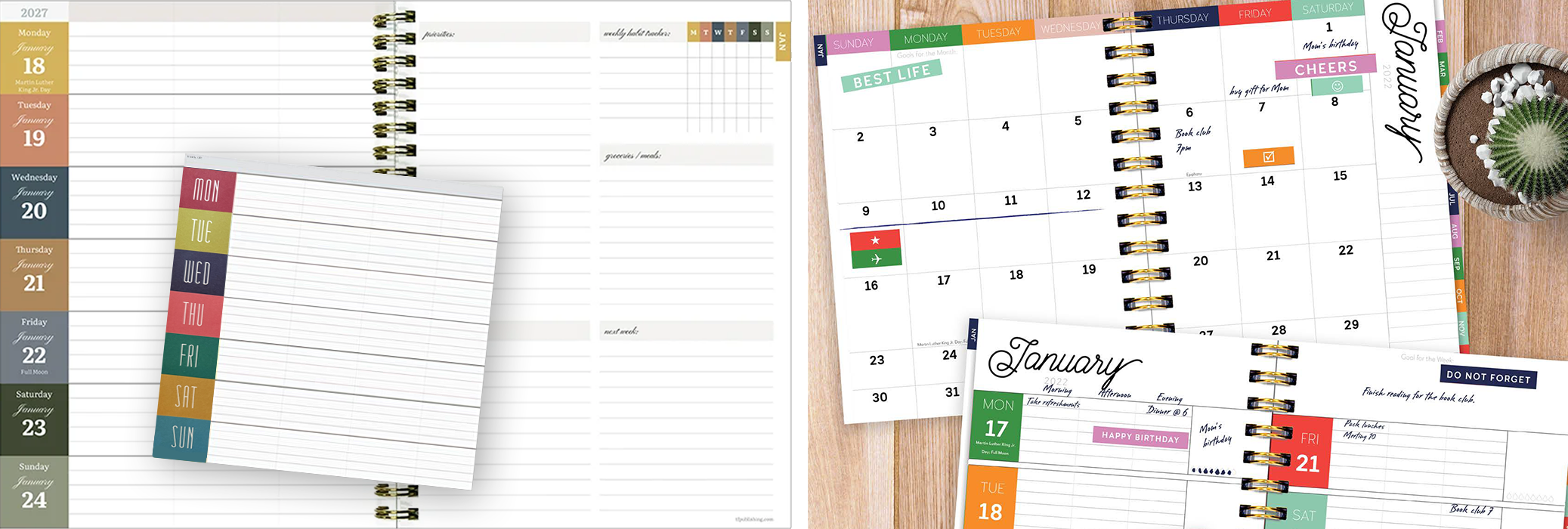
Designed more than 100 weekly/monthly planner interiors across calendar-year and academic-year editions, multiple sizes and changing visual styles. Each required balancing writing space, hierarchy, navigation and supporting planning features within a highly functional format.
After an 8.5-inch desk-pad calendar I designed became a best seller in its category, I adapted its concept, bold blocks of color, typography, and organizational structure into a weekly/monthly planner interior. The resulting design became a recurring planner format, refreshed over subsequent editions through updated typography and color while retaining its core structure and functionality.
What began as a successful calendar design became a reusable product system that could evolve visually while preserving the functionality customers responded to.
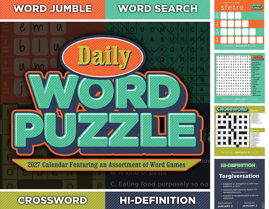
DAILY WORD PUZZLE
Developed a daily box calendar combining four distinct word-game formats into one cohesive product. Created the overall branding, color palette and visual system, then designed individual templates for Word Jumble, Word Search, Crossword and an original word-definition game, Hi-Definition.
To manage more than 300 dated pages with corresponding answers, I developed a multi-stage InDesign production workflow—building and exporting each puzzle format separately, then using those files within a master data-merge system to sequence puzzle types, answers, dates and holidays throughout the year.
The project combined the equivalent of four daily calendar systems into a single coordinated product and production workflow.
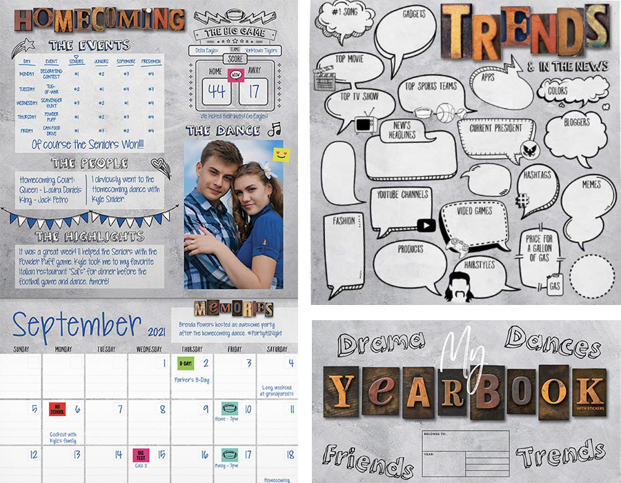
MY YEARBOOK
Tasked with developing an open-dated high-school memory calendar that could appeal to both male and female students, I created the product’s visual direction, page structure and content from the ground up.
Rather than treating it solely as a calendar, I developed it as a hybrid calendar/yearbook with spaces for documenting school events, friends, trends, activities, homecoming, dances and memorable moments throughout the year. The neutral notebook-inspired aesthetic, hand-drawn graphics and interactive prompts were designed to appeal broadly while allowing students to personalize the product with their own school colors and preferred design choices.
Sample completed pages were developed to demonstrate how the prompts, writing areas, photographs, stickers and calendar could work together as a personal record of the school year.
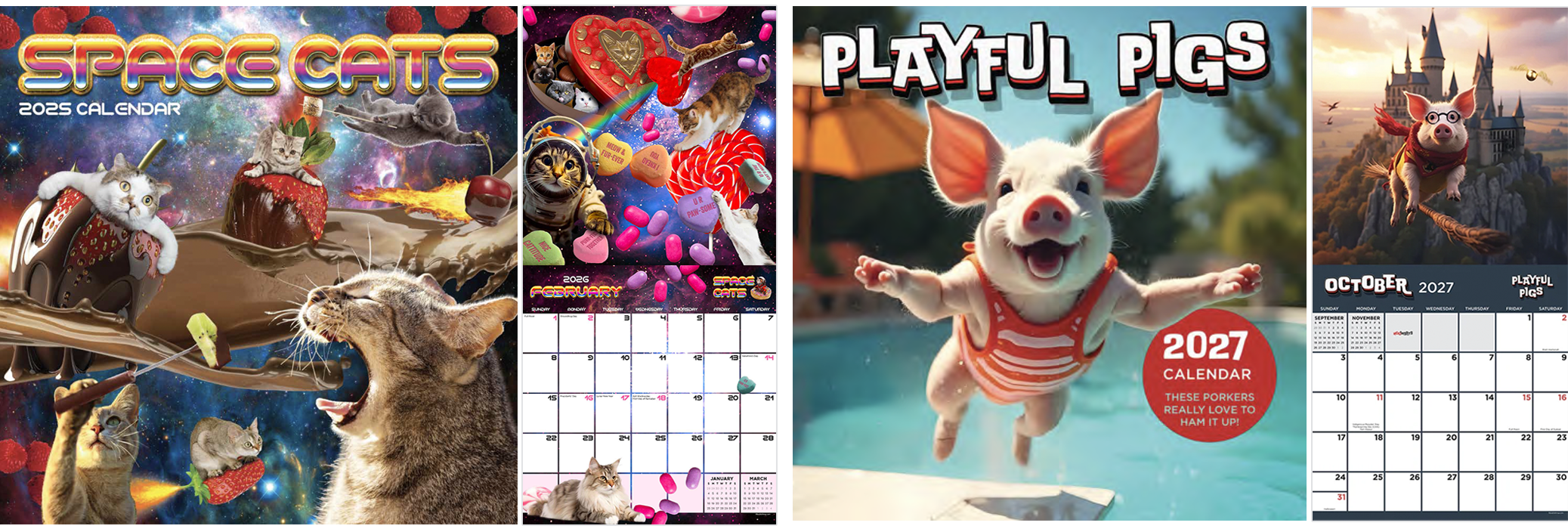
SPACE CATS + PLAYFUL PIGS
Building In-House Brands
Space Cats began as an original in-house calendar concept and grew into one of the line’s top-selling titles. Originally conceived and designed by a college summer intern under my creative direction, I later took over the title and have designed its past five editions, continuing to evolve the imagery, compositions and calendar presentation while maintaining the personality that made the original concept successful.
Playful Pigs expanded that approach through AI-assisted image development. After several years of designing the title with a limited collection of photography that required repeated reuse, I developed imaginative new scenarios and humor to refresh the established product. Sales increased following the transition from traditional photography to the new AI-assisted visual approach.
As these concepts evolved beyond traditional generic calendars, I introduced TFI Entertainment branding on Space Cats, Playful Pigs and select additional titles, helping give the products a more cohesive, ownable brand presentation.
Retail Displays & Merchandising
Designing beyond the product to create cohesive retail experiences.
My work extended beyond individual products to the displays and merchandising systems used to present them at retail, serving as the primary designer for the company’s display programs. I designed solutions ranging from single-product PDQs and licensed floor displays to large-scale assortment fixtures, retailer-specific programs and trade-show environments.
Each display balanced brand identity, product visibility, assortment size, physical constraints and the realities of the retail environment—turning collections of products into organized, visually cohesive presentations.
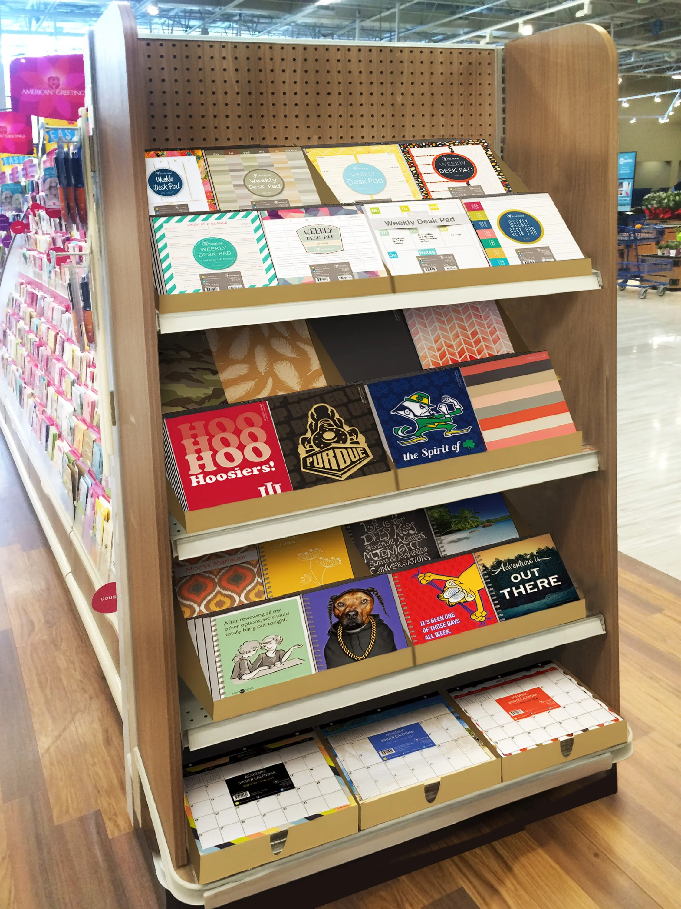
ENDCAP
Merchandising Multiple Formats
Designed a coordinated retail endcap that brought together multiple calendar and planning formats within a single presentation, including weekly desk pads, monthly planners, weekly planners and small monthly desk pads. Custom display trays organized products of different sizes while maintaining a cohesive, easy-to-shop presentation.
The display demonstrates how product design extended beyond the individual item to how an entire assortment was organized and presented at retail.
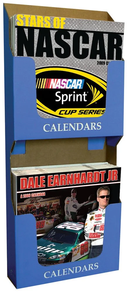
NASCAR SIDEKICK
Visibility in a Compact Footprint
Designed a two-tier sidekick display to merchandise multiple calendar titles within a compact retail footprint. The open-front structure provided clear product visibility and easy access while accommodating multiple titles in a vertical presentation.
The generic display structure allowed different licensed calendar assortments to be merchandised in the same fixture, with the products themselves providing the branding and visual impact.
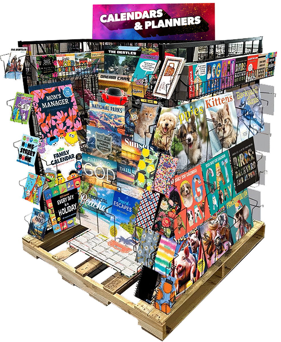
FULL PALLET DISPLAY
High-Capacity Retail Merchandising System
Designed to merchandise a broad assortment of calendars and planners within a single retail footprint. The multi-sided display organized wall calendars, planners, daily calendars, and other formats while maintaining clear product visibility and making a large assortment easy for customers to browse.
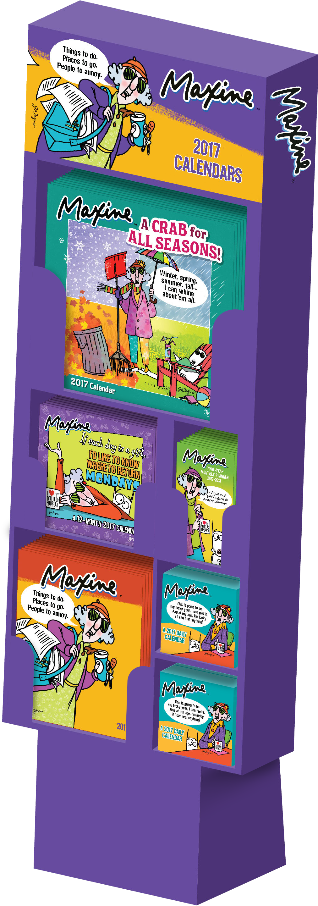
MAXINE LICENSE DISPLAY
A Cohesive Single-Brand Display
This concept demonstrates depth within a single license, bringing multiple Maxine product formats together as a coordinated retail program with a strong, cohesive shelf presence.
The display extends the Maxine visual identity across multiple formats while allowing each product to remain distinct within the larger branded assortment.
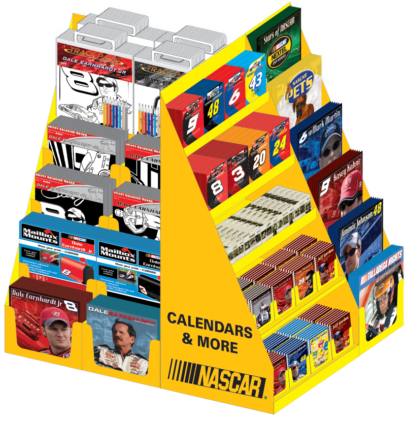
NASCAR PALLET DISPLAY
Large Single-Brand Assortment
Developed a custom pallet-display concept for Kmart to merchandise the breadth of the NASCAR calendar program, organizing multiple drivers, calendar formats and price points within a single branded retail destination.
The display was designed around the scale of the NASCAR program, giving individual drivers and formats their own visibility while presenting the assortment as one cohesive licensed collection.
CONTEMPORARY DISPLAY SYSTEM
Every Product Needs a Home
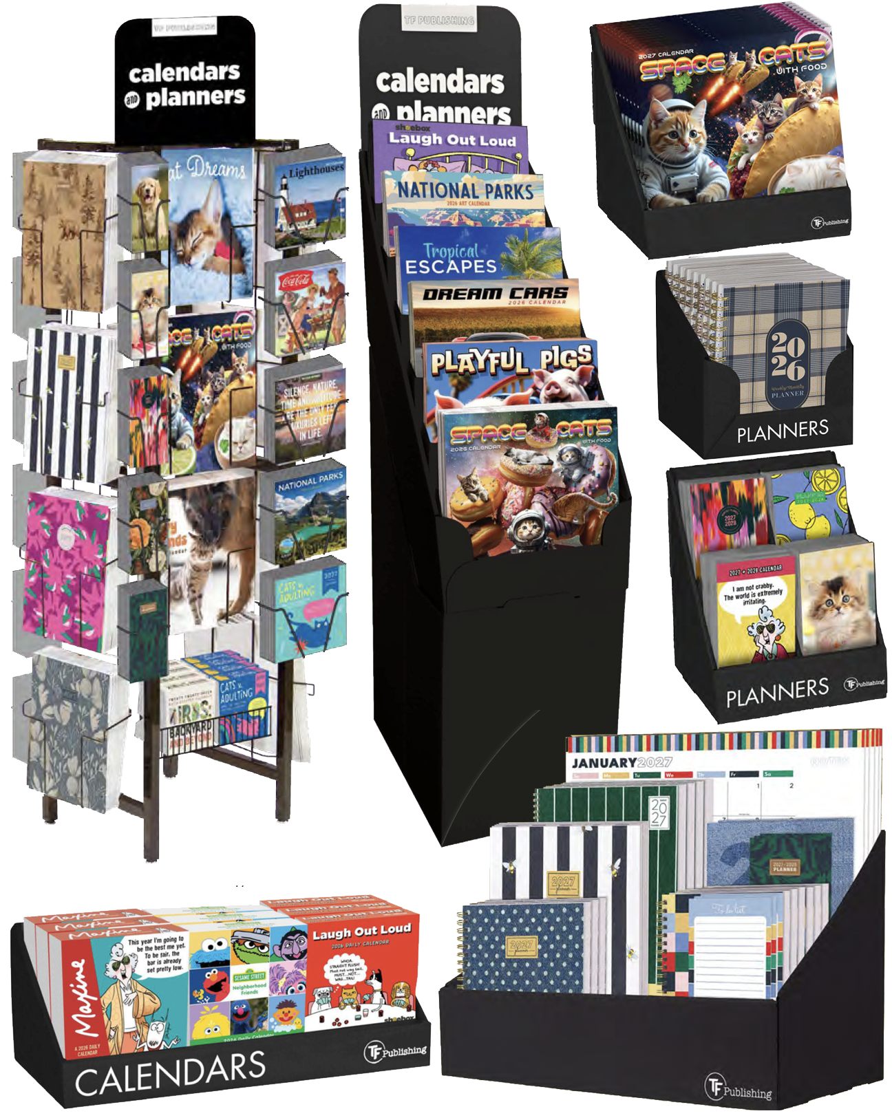
Developed a range of retail display solutions to merchandise an expanding assortment of calendars, planners and specialty formats. Displays were designed around the specific size, quantity and shopping behavior of each product—from compact single-format PDQs to floor displays capable of merchandising an entire mixed-format program.
A coordinated display system gave retailers flexible options for presenting individual products, licensed collections or complete calendar and planner assortments.
NASCAR TRADE SHOW BOOTH
Extending the Brand Beyond the Product
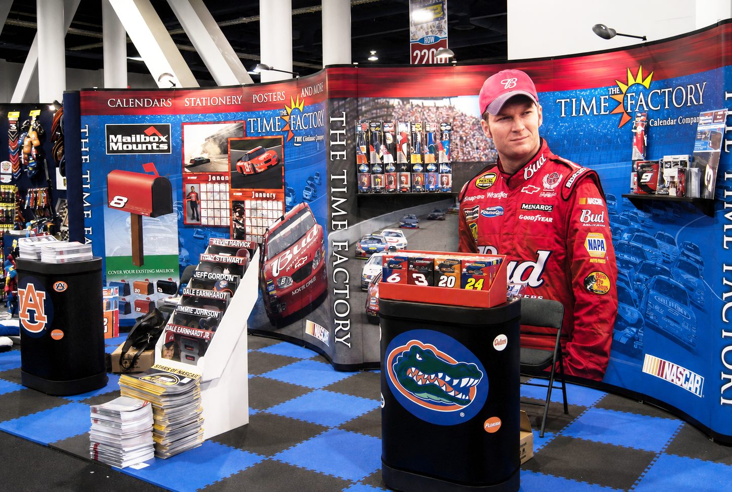
Designed a NASCAR-focused trade show booth that transformed the licensed product line into a complete branded environment. Large-scale graphics, product imagery and merchandising displays worked together to create an immersive presentation while showcasing the breadth of the calendar and related product assortment.
The booth extended the visual language of the NASCAR program from individual products and retail displays into a large-scale environment designed to attract attention on a busy trade show floor.
Product Catalog
Turning hundreds of products into an organized sales tool.
Served as the primary designer for the company’s annual product catalogs throughout my tenure, organizing hundreds of products across licenses, formats and categories. Developed visual systems that helped buyers navigate the assortment, compare product options and understand key features while maintaining a cohesive presentation throughout each catalog.
QUICK REFERENCE GUIDE
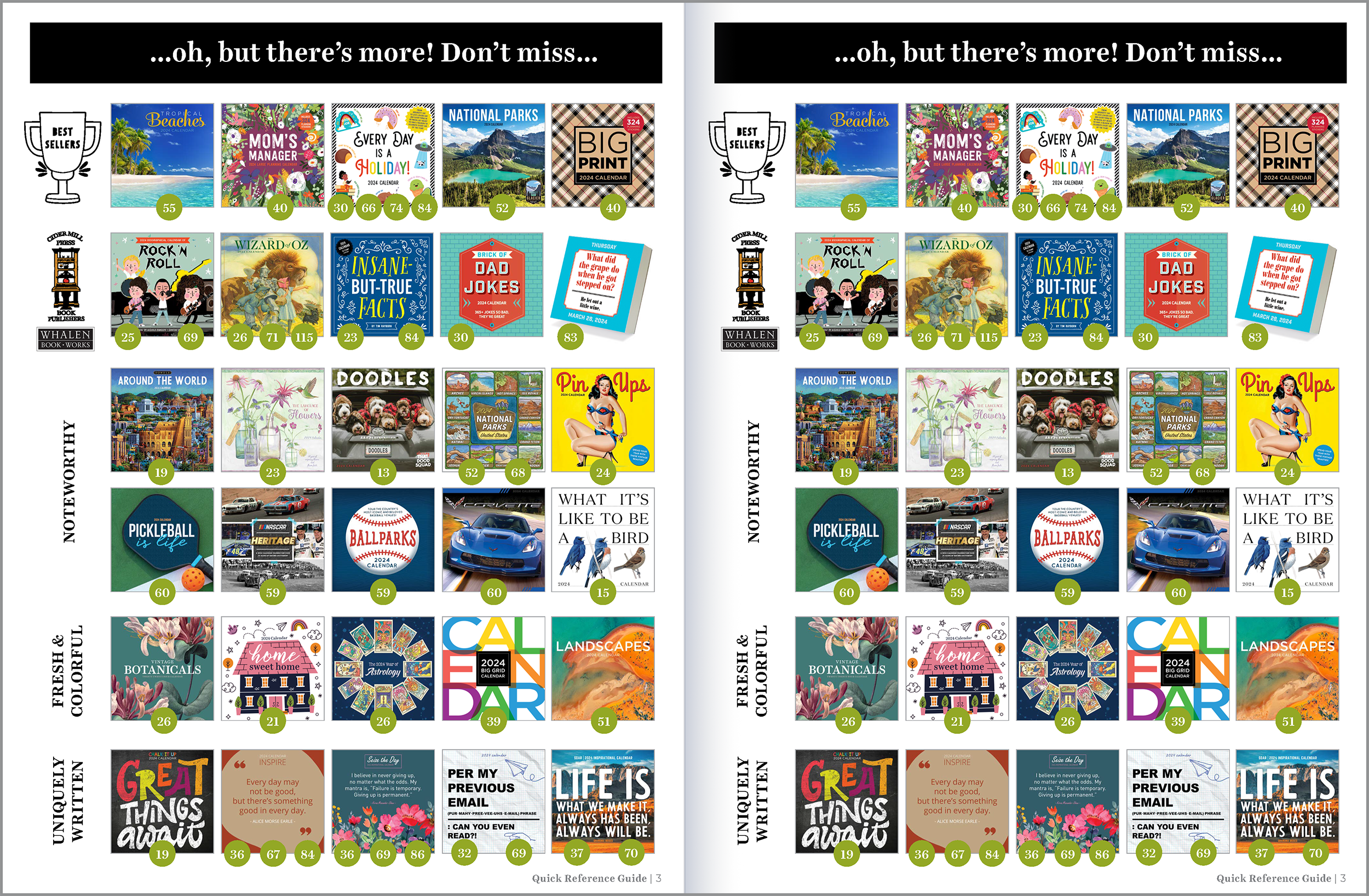
Organized a large product assortment into an easy-to-scan reference system for buyers and sales teams.
THE BEATLES LICENSED PRODUCT LAUNCH
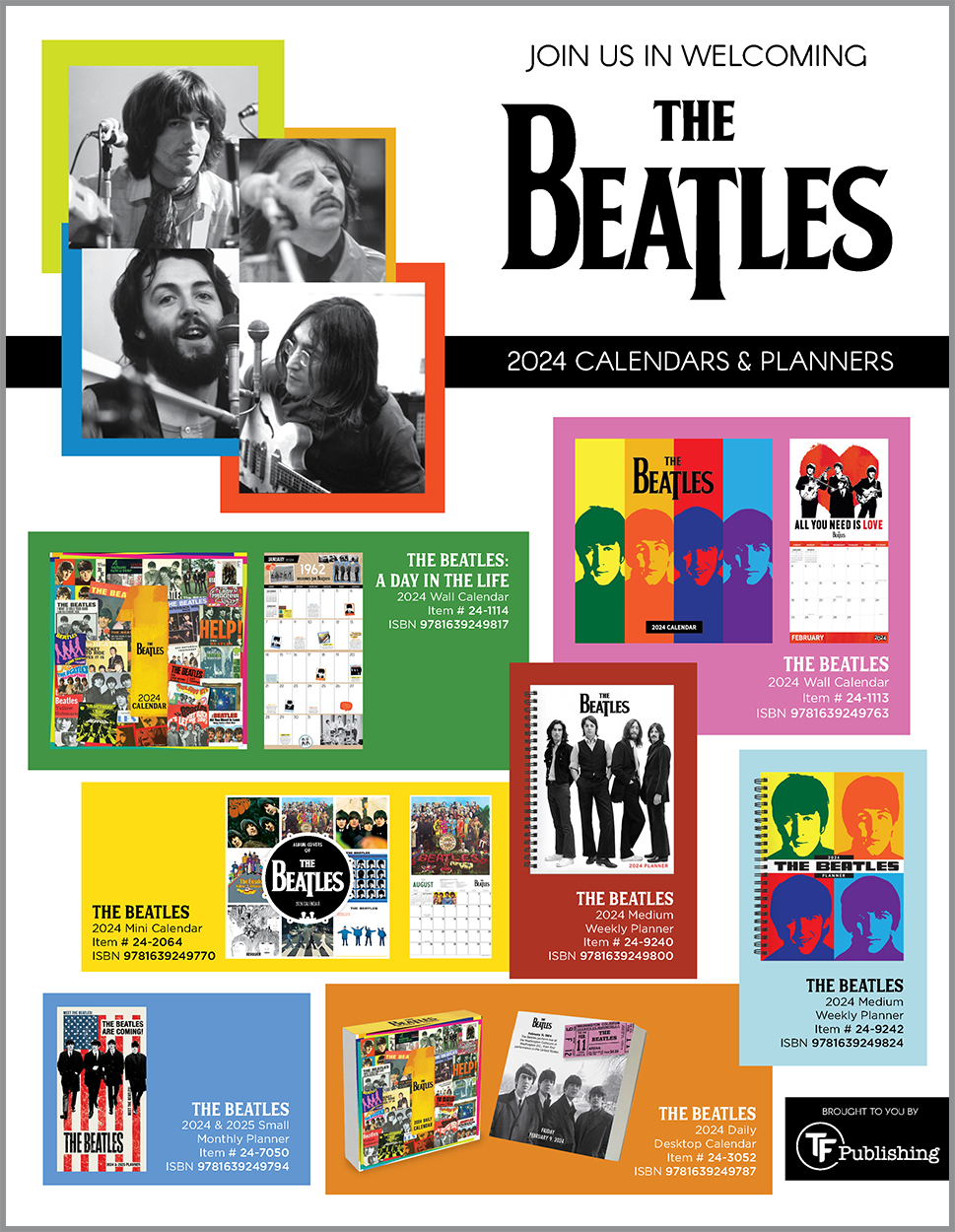
Presented multiple product formats as a cohesive licensed collection while maintaining a strong branded presentation.
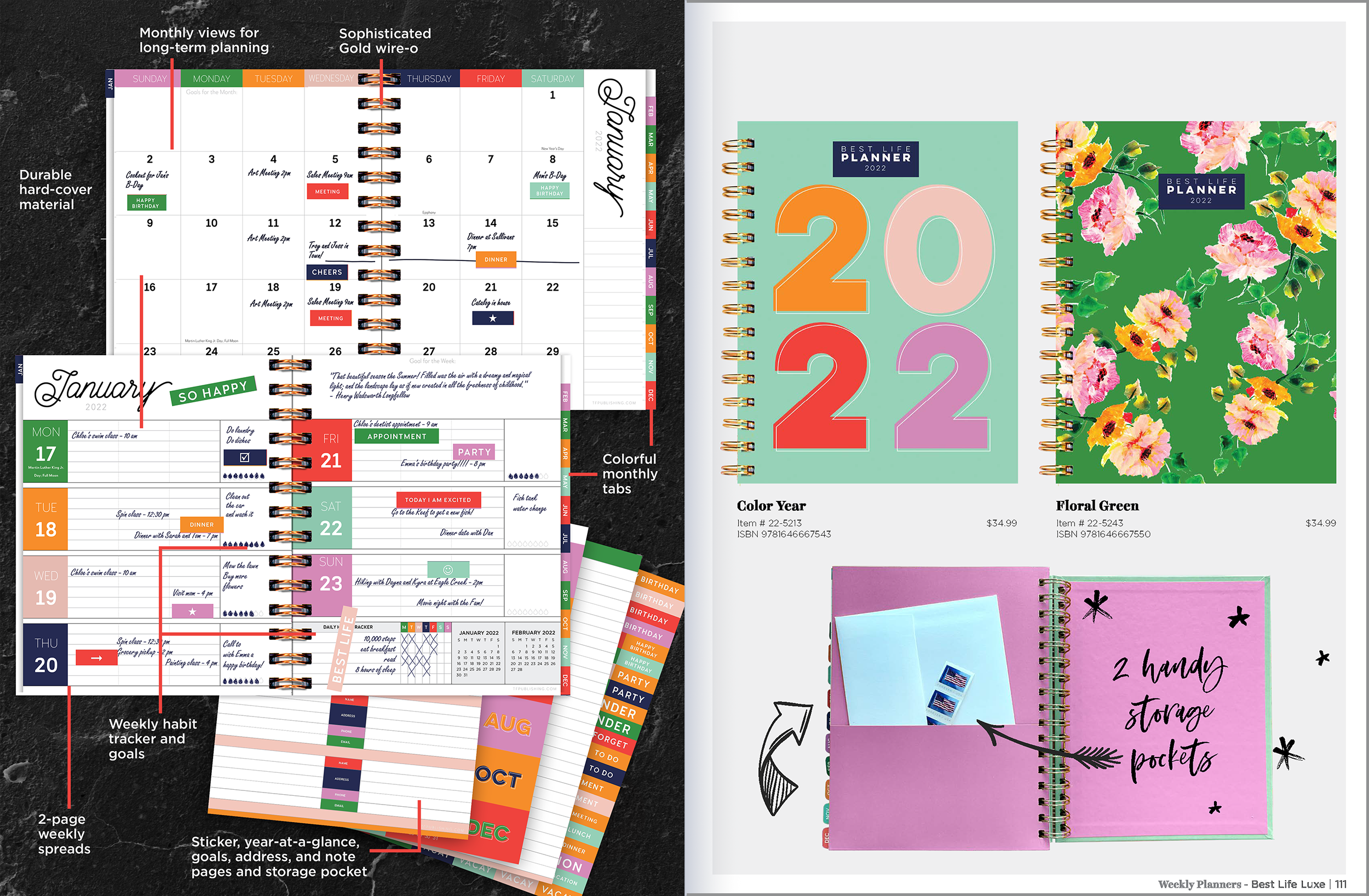
BEST LIFE LUXE — FEATURES & BENEFITS
Combined product imagery, specifications, and key features into a clear sales-focused presentation.
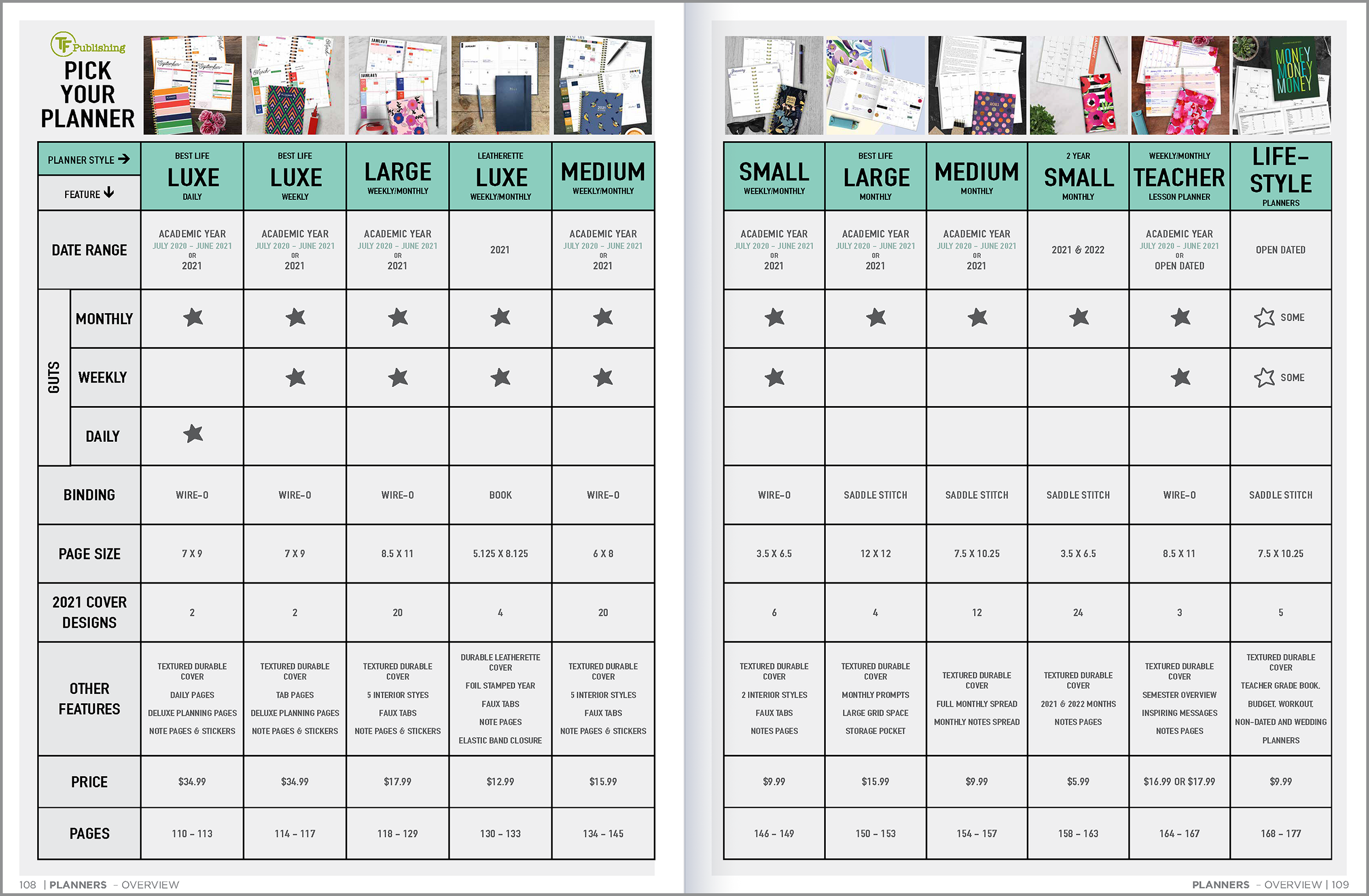
PLANNER COMPARISON SYSTEM
Structured multiple planner formats, features, specifications, and pricing for quick comparison and product selection.
2027 CALENDAR AND PLANNER CATALOG
View the Complete Catalog
Explore the full 2027 catalog to see how hundreds of products, formats, collections, and merchandising options were organized into a cohesive sales presentation.