
PRODUCT DEVELOPMENT
I approach product development as problem solving—balancing audience needs, market appeal, available assets, brand requirements, product format, and production considerations to create products that are visually compelling, relevant, and ready for market.
Guiding products from concept through creative development, approval, and production readiness.
The Challenge
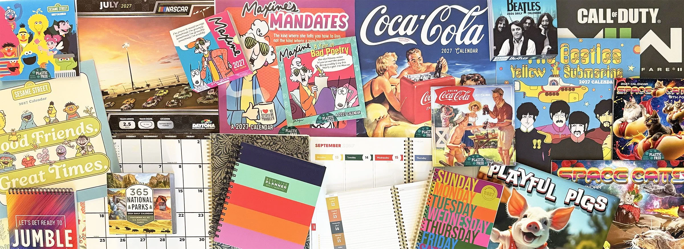
Creating successful consumer products requires balancing many competing considerations: what will attract the customer, who the product is for, available imagery and assets, brand requirements, retail needs, product format, production limitations, and ultimately whether the finished product feels worth picking up.
Unlike client-driven design, much of our product development began before there was a buyer. We developed the concepts and products first, then Sales presented them to retailers.
My Approach
Design is problem solving—but the solution changes with every product.
I begin by understanding the audience, objective, available assets, product format, and any brand or production requirements. From there, I use research, experience, creative judgment, and collaboration to determine the visual direction and identify opportunities to make the product more engaging, useful, or distinctive.
01 — Identify the Opportunity
Look for opportunities to expand a line, solve a need, or create something new.
Product development often began by recognizing an opportunity within an existing license, product category, or market. That could mean extending a successful brand into a new format, developing an original concept, or finding a better way to use available content.
Ideas came from sales needs, licensing opportunities, market trends, and my own observations of where a product line could grow.
EVERY DAY IS A HOLIDAY
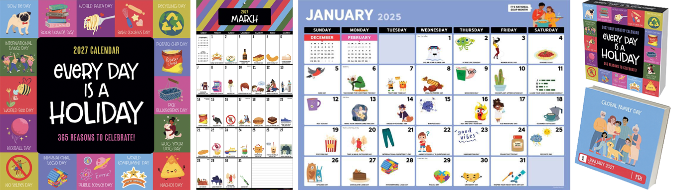
Turning an original idea into a long-running product.
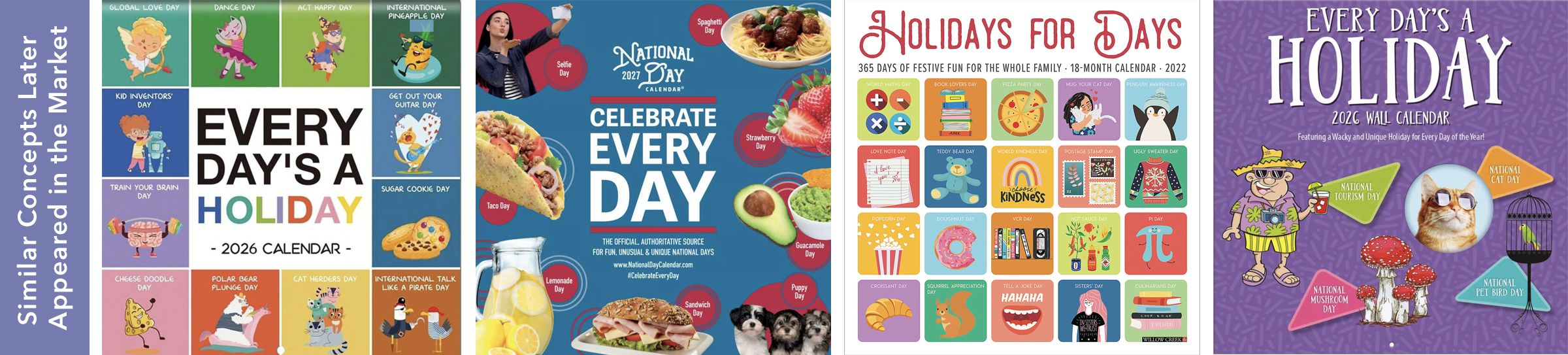
I proposed a calendar built around fun and unconventional daily observances, giving consumers something new to discover each day. While the ongoing visual design was created by other members of the creative team, I originated and presented the product concept. Introduced more than a decade ago, it became an annual bestseller and remains in the product line today.
LAUGH OUT LOUD
Repositioning an existing product to improve consumer appeal.
After ShoeBox calendars underperformed expectations, I questioned whether consumers recognized the ShoeBox brand. Informal feedback suggested many did not. I proposed repositioning the calendar as Laugh Out Loud, putting the humor and consumer benefit at the forefront rather than relying on brand recognition. Sales increased following the change, and Laugh Out Loud has remained the title of the product line ever since.
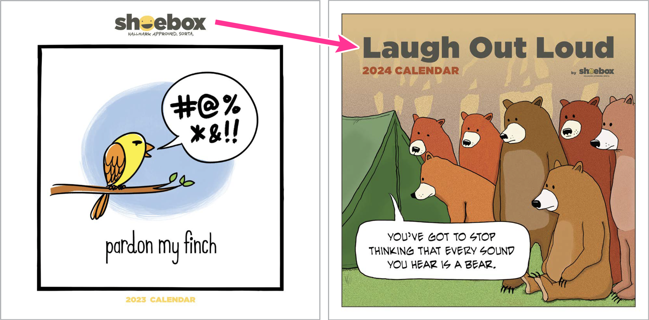
Original ShoeBox product shown for context.
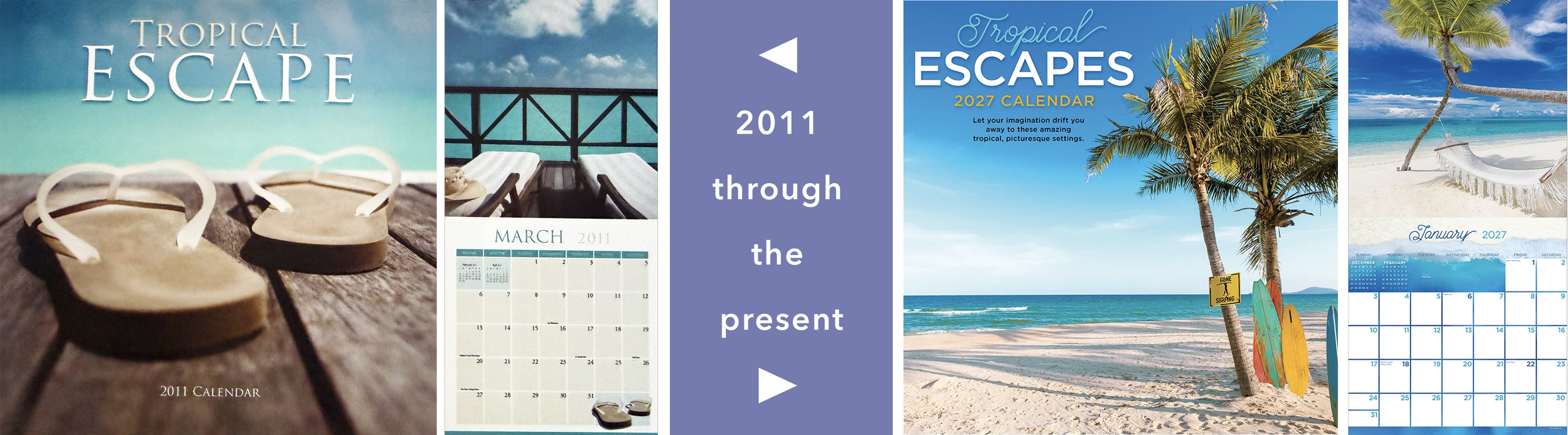
TROPICAL ESCAPES
Extending a proven category with a new concept.
Building on the success of Tropical Beaches, I proposed Tropical Escapes—adding elements such as hammocks, beach chairs, umbrellas, and cabanas to create a more aspirational interpretation of the category. Introduced in 2011, the title remains part of the product line more than 15 years later.
02 — Design for the Audience
Make creative decisions around who will ultimately choose and use the product.
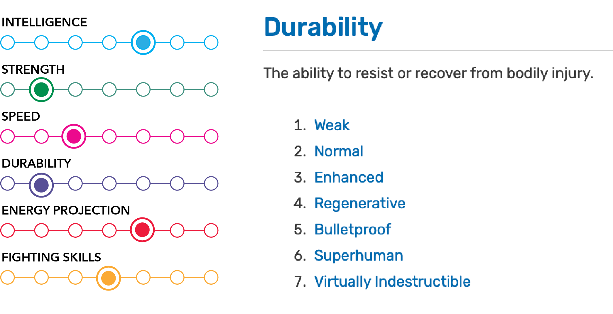
Marvel
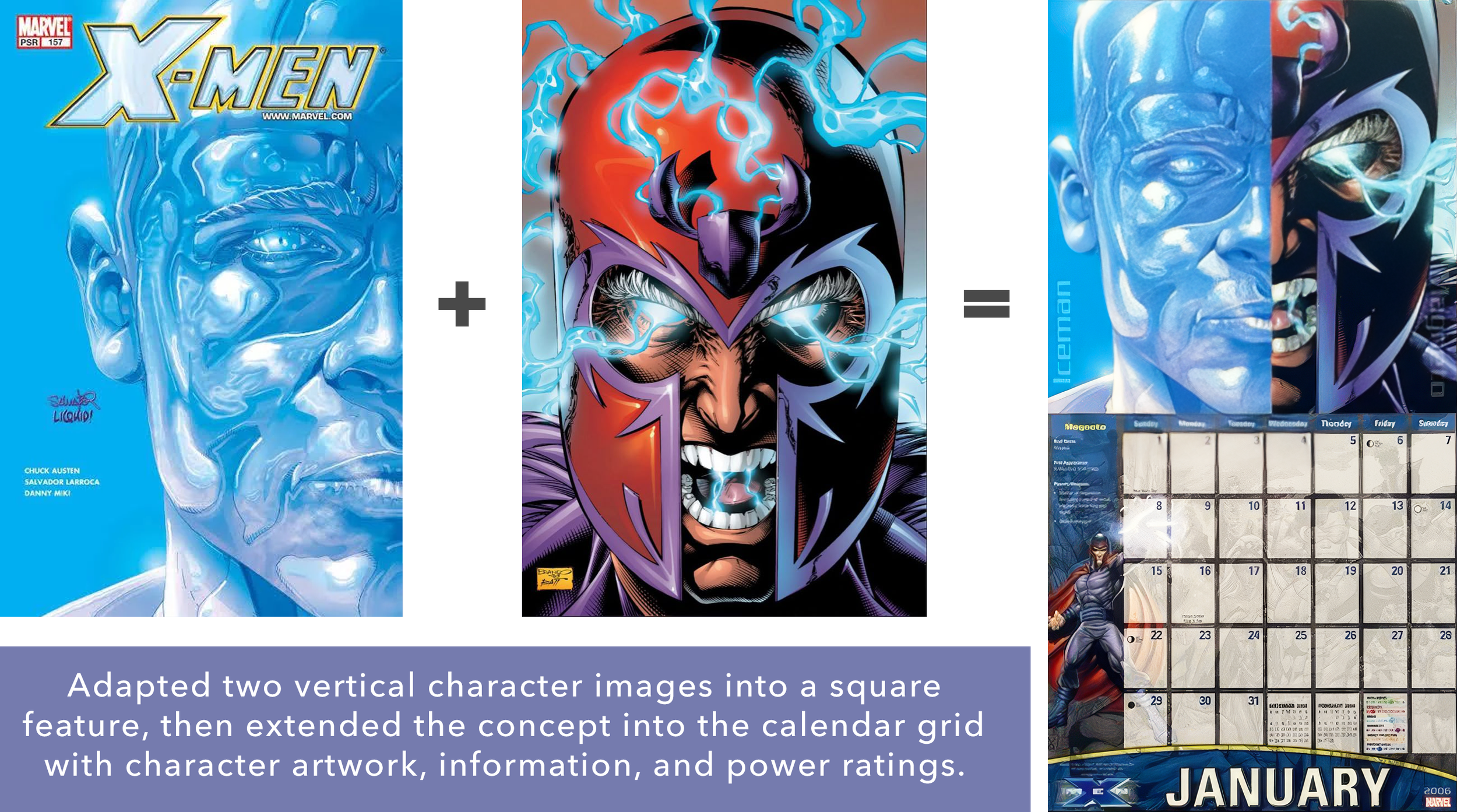
Adding character information and ratings for intelligence, strength, speed, durability, and other attributes gave each calendar page another layer of content tailored specifically to what a fan would want. A rating guide explained what each level represented.
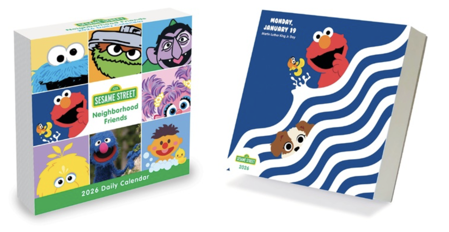
Sesame Street
Balanced kid-friendly fun, educational value for parents, and the nostalgic appeal Sesame Street holds for adults.
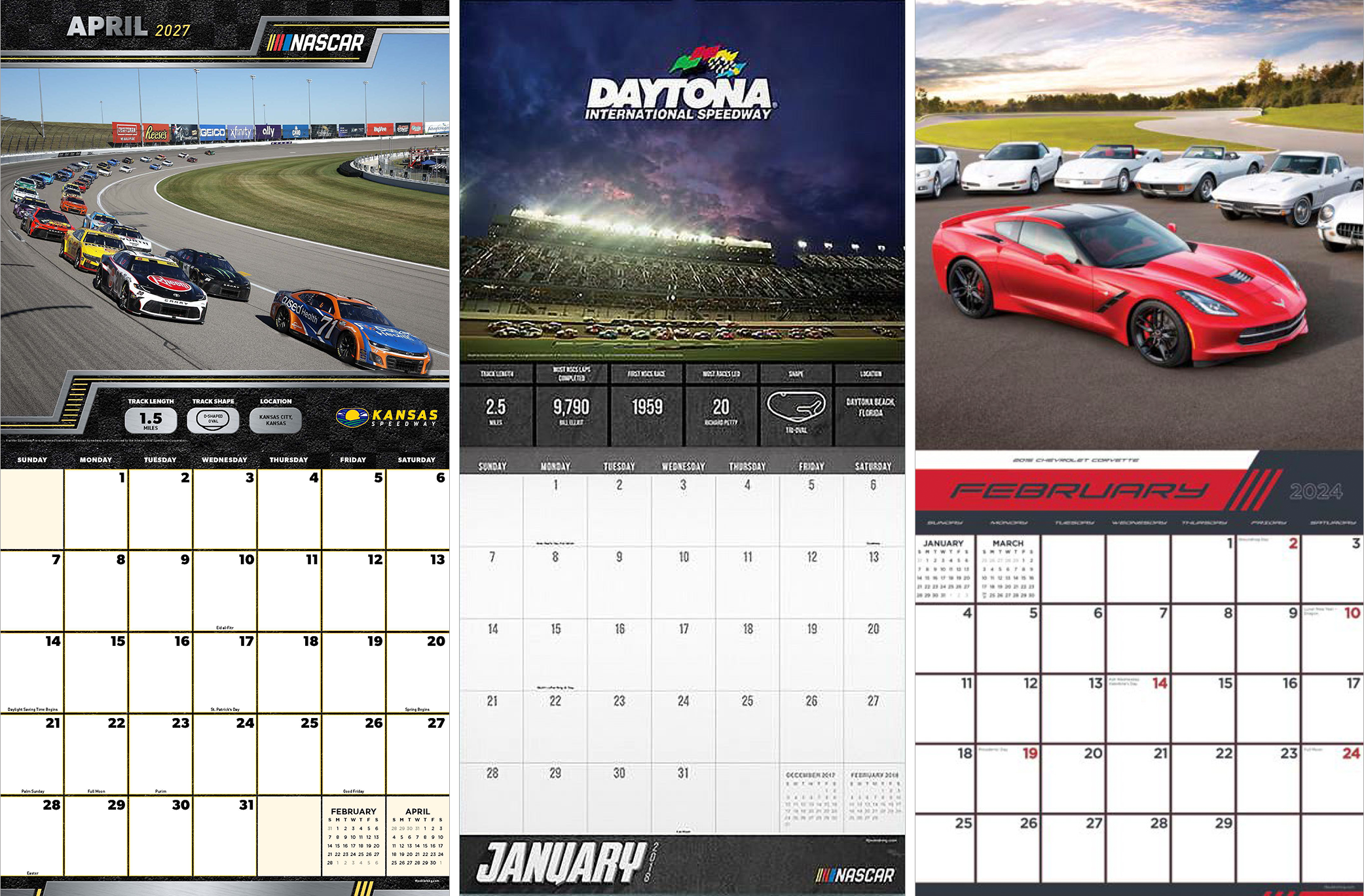
NASCAR + Automotive
A predominantly male audience led toward heavier typography, metallic treatments, and bolder visual language than much of the broader calendar line.
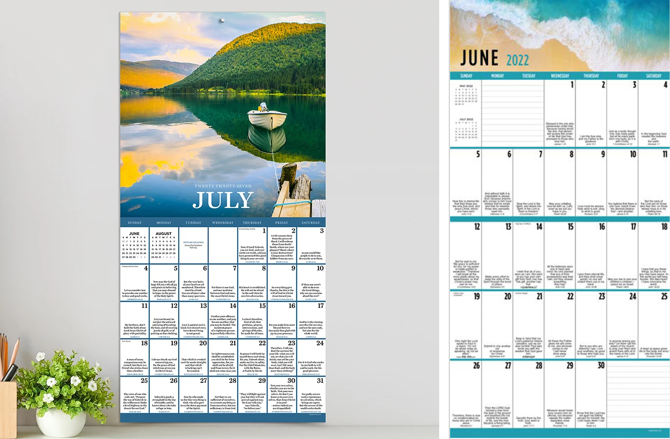
Daily Verse
Typography and readability were adjusted for an older demographic without allowing the design to feel oversized or visually dated.
03 — Find Creative Room Within the Brand
Understand the rules, then determine where creativity can happen.
NASCAR — Broad Freedom
Relatively limited creative restrictions beyond accurate branding, current cars, and appropriate racing imagery allowed significant flexibility in visual direction.
Coca-Cola — Brand-Critical Details
Creative freedom within approved asset collections, with particular attention to accurate logo treatment, trademark visibility and Coca-Cola red.
Sesame Street — Highly Structured
Detailed style guides controlled fonts, colors, character usage and asset combinations, with multiple reviewers and often multiple rounds of revisions.
MARVEL — Broad Freedom
I searched Marvel's image library, identified compatible artwork, recombined layered assets into compositions better suited to square calendar formats, and introduced additional fan-oriented information such as the character strength/power ratings.
Sustaining Products Year After Year
Keeping established products fresh without losing what made them successful.
Many calendar titles remained in the product line for decades, but the creative work started again each year. Some licensed products needed continuity with established branding, while others required an entirely new visual direction annually. The challenge was balancing familiarity with enough change to give consumers a reason to purchase the next edition.
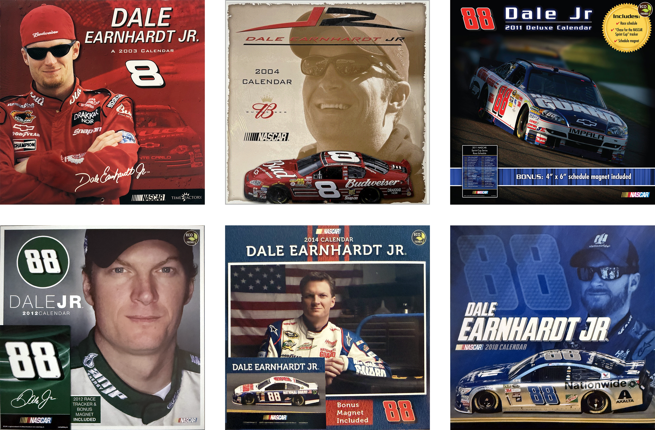
NASCAR — 20+ Years of Reinvention
NASCAR products received new photography each season, but the design also had to evolve year after year. Over more than 20 years, I continually developed new visual approaches while maintaining the bold, performance-driven character expected by racing fans.
Evergreen Titles — Familiar Subject, Fresh Product
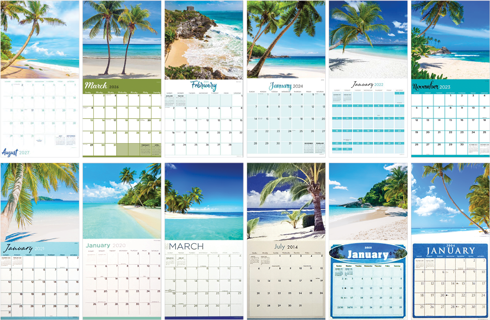
A title such as Tropical Beaches may appear straightforward in isolation, but each annual edition required a fresh solution. Typography, color, image treatment, supporting graphics, and grid design were reconsidered each year—and often adapted month to month—to create a cohesive relationship between each feature image and its calendar grid
Different Problems. Different Tools.
The strongest solution depends on the product—not the tool.
Different concepts required different approaches to imagery, from traditional photography and Photoshop compositing to AI-assisted image creation. I chose the method based on what best supported the concept, audience, and finished product.
Space Cats
Photography +
Photoshop Compositing
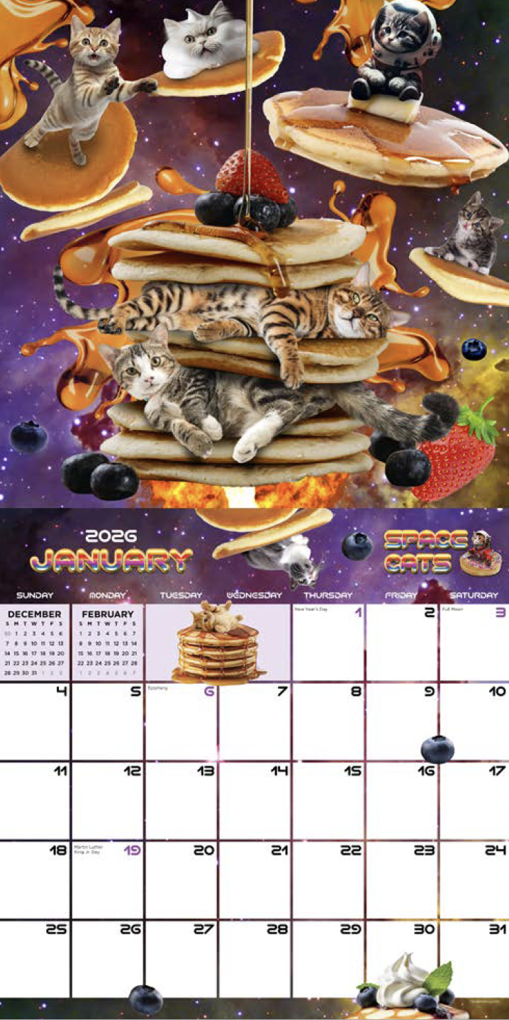
Combined real cat and food photography through Photoshop compositing to create an original fantasy series that remained in the product line for more than five years. After experimenting with more AI-generated imagery, I returned to predominantly photographic assets when they produced a stronger result.
Playful Pigs
AI-Curated images
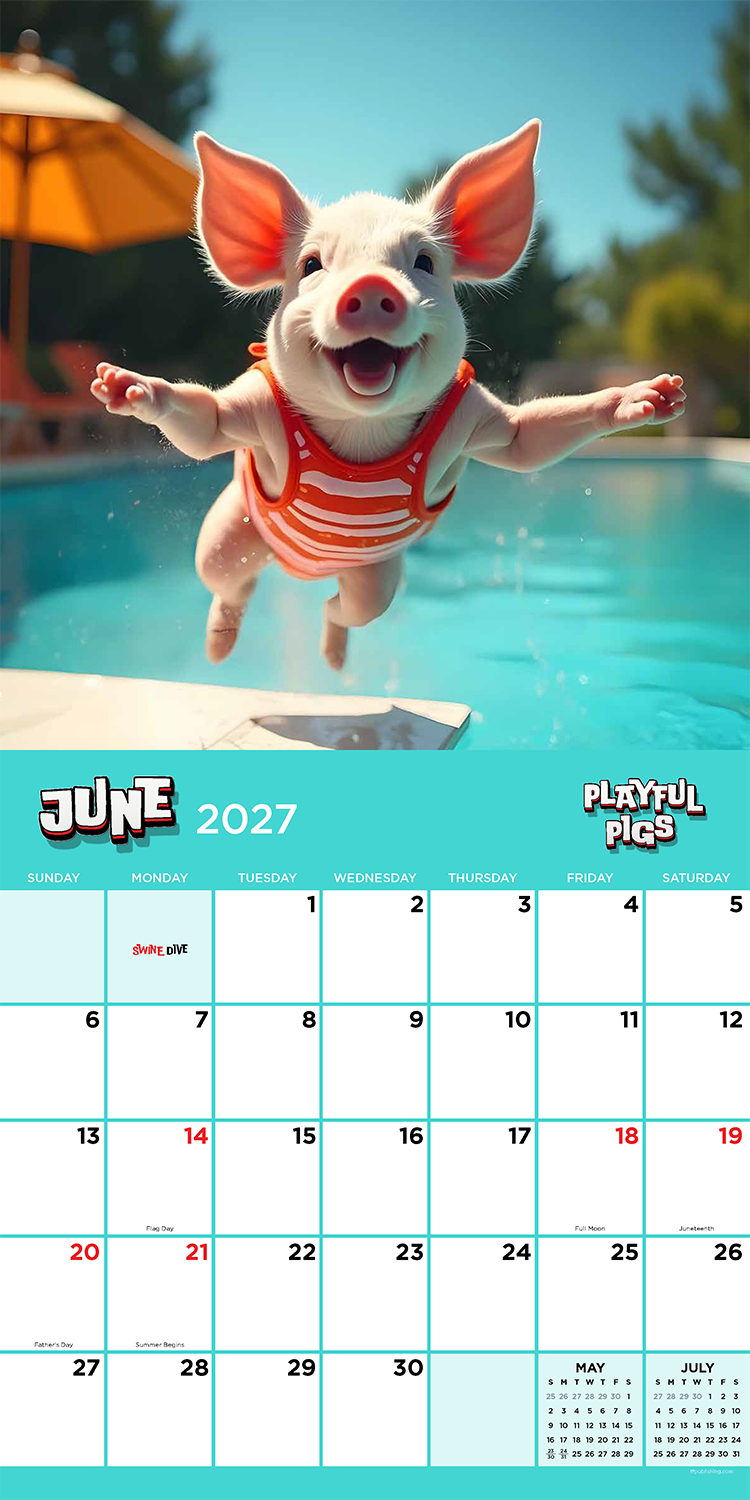
Reimagined an established title after its photography library had gone largely unchanged for years, using AI-generated imagery to refresh the product. Sales increased following the redesign.
04 — Refine, Adapt & Prepare
Refine the concept, resolve the details, and prepare it for production.
Each product moved through internal review, licensing approval when required, and final production preparation. I established peer review as part of the creative process, giving designers an opportunity to identify inconsistencies, discuss solutions, share techniques, and strengthen the work before it advanced.
Feedback was treated as part of the design process rather than simply a list of changes. Designers retained ownership of their work while considering suggestions from the team, and required changes were discussed so they understood not only what needed to change, but why. Licensed products added another layer of review, requiring designs to adapt to brand standards and licensor feedback while preserving the strength of the original concept.
Peer Review
Each product received a creative review focused on visual consistency, readability, image quality, hierarchy, and overall execution. The collaborative process helped improve individual products while giving designers exposure to different approaches and opportunities to learn from one another.
Licensor Review & Adaptation
Approval requirements varied significantly by brand. Some licensors allowed broad creative freedom, while others required strict adherence to specific assets, typography, colors, and usage guidelines. Designs were refined through feedback and multiple approval rounds when necessary before being released for production.
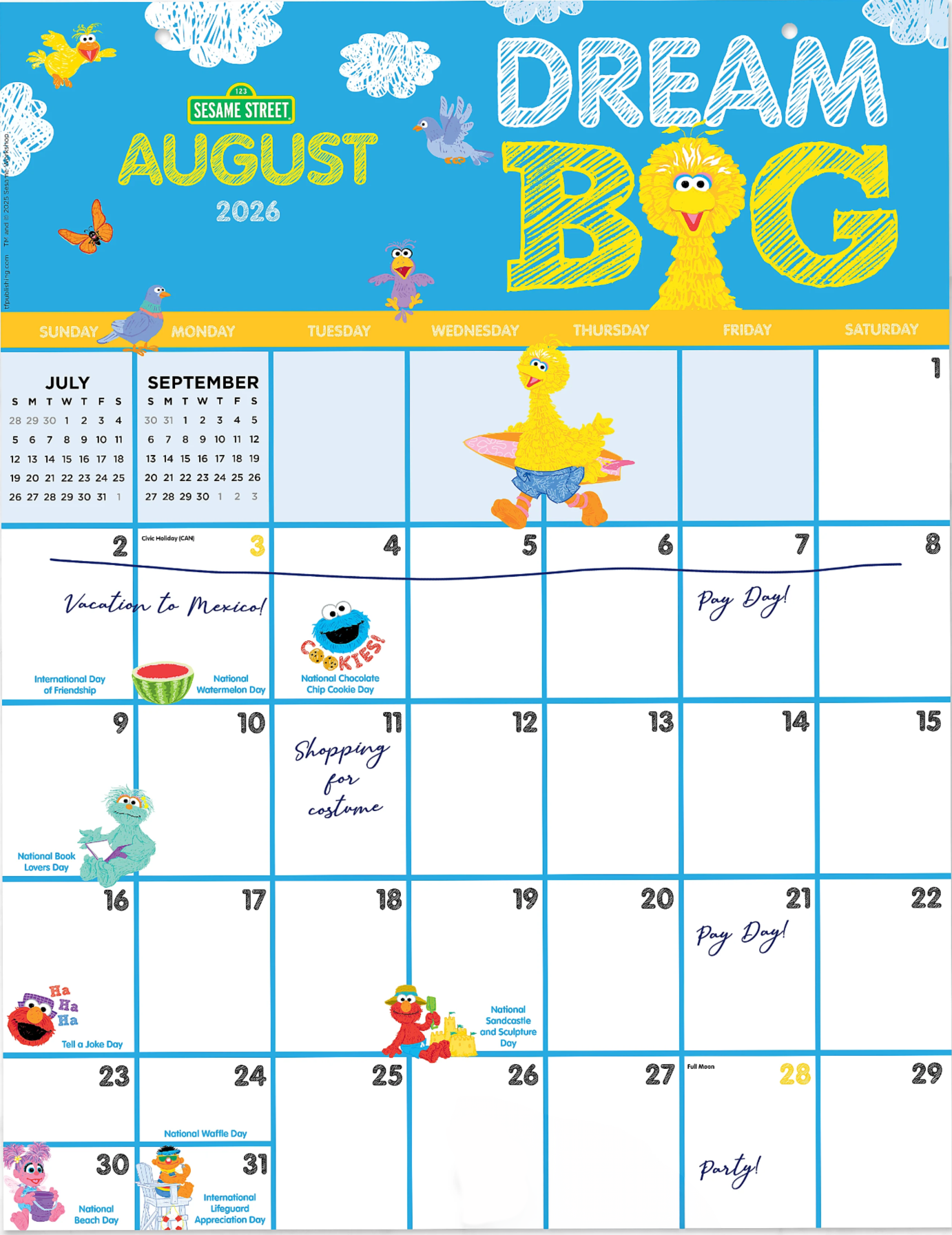
Sesame Street — Adapting the Idea
For a children’s calendar, I proposed adding fun daily observances to make the product more engaging and educational. Sesame Street’s rigorous approval process evaluated every detail for age appropriateness and brand standards, requiring some seemingly harmless concepts to be removed or revised. The product evolved through several rounds of feedback while maintaining the playful intent of the original concept.
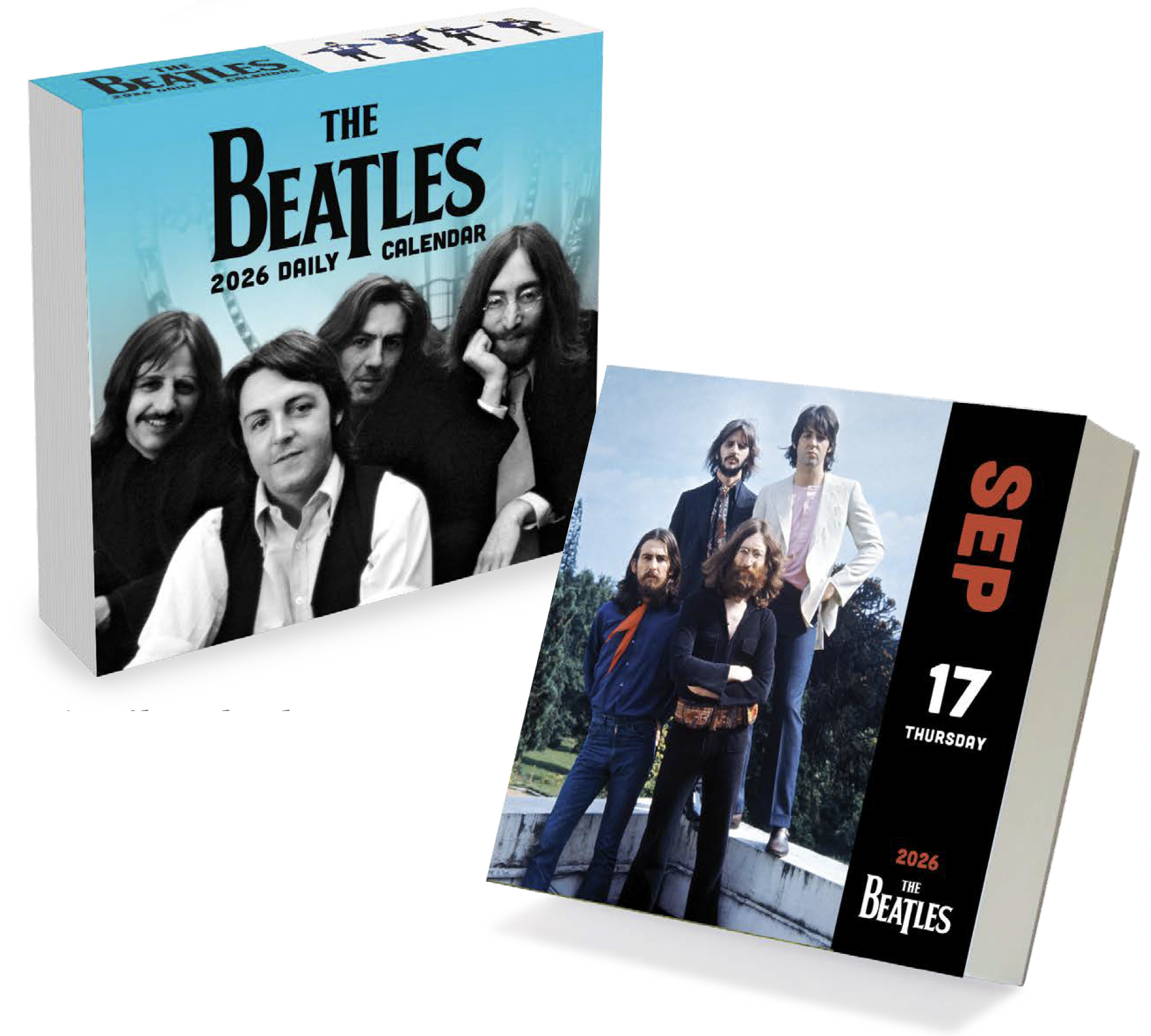
The Beatles — Working within Constraints
A multi-year daily calendar required reusing a limited library of approved imagery. To give the product a fresh approach, I proposed reorganizing the content around a countdown of the band’s top songs, incorporating album artwork and related information. When the concept wasn't approved, I adapted the existing assets into a new arrangement while remaining within the licensor’s requirements.
What Product Development Enabled
Original Product Concepts
New ideas expanded successful categories and created long-running additions to the product line.
Audience-Relevant Design
Creative direction adapted to different consumers, categories, and retail environments.
Brand Integrity
Flexible design thinking worked within licensing requirements ranging from broad freedom to highly controlled brand systems.
Continuous Improvement
Review, experimentation, and evolving tools helped products remain fresh while maintaining proven strengths.